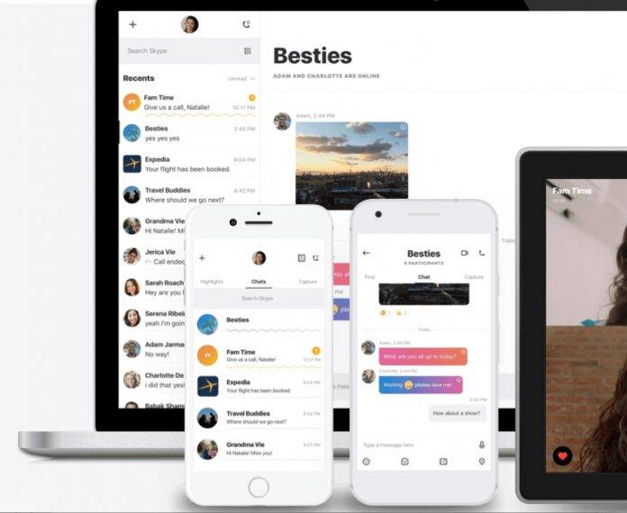
Just a few days ago, Skype shared with the world that they were redesigning their entire messaging app, supposedly to fit their users’ needs. Some people saw it more as a bid to recapture a market that has been drawn to the Snapchats and Messengers of this world rather than stick with the “legacy” of Microsoft’s free messaging and calling app. But either way, the overhaul is now here and available for Android devices and coming soon to other platforms as well.
If you’ve already forgotten what the new Skype will look like when you update your app, it now has three main tabs. The one in the center is where all your chats reside and where you will probably still spend most of your time if that’s what you just use Skype for. But they’re hoping you’ll use the other two tabs as well. Highlights is one of the things that they copied from Snapchat (and what other messaging apps copied from them) where you can share photos and videos from your day and where your friends can view them as a highlight reel.
The other tab is also something they may have copied from Snapchat, as you can take a picture of yourself or something you like and then edit it, add stickers, text, annotations, etc. This supposedly makes a messaging app fun, but for people who are used to using Skype for business, this may actually seem weird.
You can probably choose not to update Skype since they haven’t really said what would happen if you don’t. But you probably won’t be able to enjoy other features they will introduce later on if you stick to the old one. But if you’re ready to update, just go to the Google Play page.


