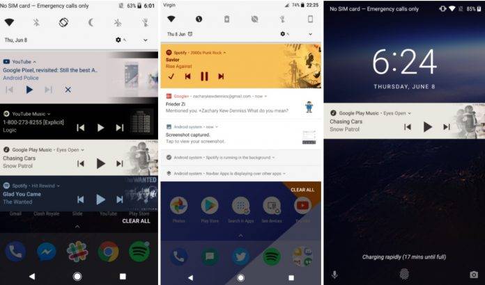
While we’re still waiting for an official name for Android O and the announcement as to when it will start the very long process of rolling out, the developer preview is still ongoing and bringing updates to those testing out the next major update. The newest thing that developers are seeing and which will probably make it to the final build is that the notifications for media apps like YouTube Music, Spotify, etc will reflect the color of the album art or video thumbnails.
This will make your notification center a little more colorful as the music you listen to will of course have different colors. But don’t worry, they’re actually using “muted” colors so that it will still be easy on the eyes without being too shocking to the senses. It also makes it more interesting to look at what’s currently playing on your streaming services.
The thumbnail will also fade into the notification as a minor visual effect. However, for apps that have wide-screen thumbnail notifications like YouTube, you’ll see black bars at the top and bottom, but that’s probably forgivable. The album art will still be noticeable larger but still with space for the title and “author” of the work.
The more colorful media notifications will be applicable for Spotify, Google Play Music, YouTube Music, and other app like YouTube Red and Chrome that lets videos play in the background. If you have the Android O developer preview, update it now to see this new, neat trick.
VIA: Android Police


