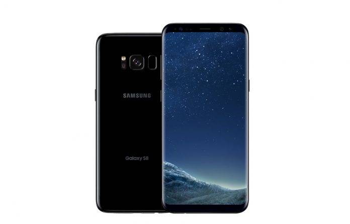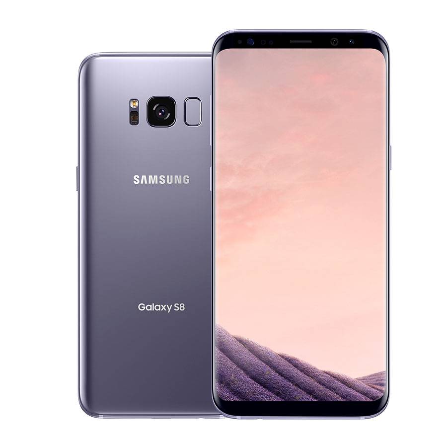
No matter how great the design of your smartphone is, sometimes it can get ruined by the tacky carrier logos that they still insist on putting on them. Apple is the only exemption as they have not allowed any of the US carriers to put their logos anywhere near their iPhones. And now it looks like Samsung is also exerting their leverage, since their newest flagship devices, the Galaxy S8 and the Galaxy S8+ do not have an AT&T, T-Mobile, or Verizon branding on them.
Since the front of the Galaxy S8 is so pretty, there is no room for any other thing to be put in there and that’s perfectly fine. The back is another matter as there is actually a lot of space to put a check mark or a small globe or a T somewhere there. But surprisingly, Samsung was able to demand from the big 3 to not include their logos anywhere in the smartphones. When you turn on the phones, you will of course still see the splash screens loudly proclaiming what carrier you use.
The practice of putting carrier logos is somewhat dated already as this doesn’t really push brand “loyalty” nor does it prevent users from leaving. In fact, it might even be a factor against the carrier if someone is thinking of getting a plan from them. Good thing that T-Mobile has already stopped this practice and hopefully, AT&T and Verizon will follow suit.

The Galaxy S8 and S8+ officially hit the markets on April 21, and despite a few murmurings about Bixby and the reddish tint of the display, people are quite excited about the new smartphones. Let’s see if they will earn Samsung some goodwill.
VIA: The Verge


