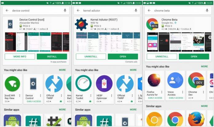
Google likes to sometimes play around with what the Google Play Store UI looks like, and depending on the response of users, they sometimes keep it or discard it or try out something else. This time around the new look involves bigger looking cards in the search results when it comes to what they determine is the app you’re actually looking for. Of course there are still other search results in case you’re looking for something else, but they’re part of a side scrolling list.
The old UI gives you equally sized card lists whenever you type in a search term in the Play Store. Now you get the most likely search results in a large card, which shows information like average star rating, the number of ratings, approximate number of downloads, content rating, and if it has a Top Developer status. You also get video preview (if any) and the screenshots to give you a better idea of what the app looks like. You will see the other suggested apps in either “You Might Also Like” or “Similar Apps” and in a smaller card that is side scrolling.
The new UI will only show up if you type out the full name of the app but not click on the prompted app page. But if you do know the app name already, you will probably click on the prompted app, so it’s really not that useful. And if you don’t know the exact app but want to look for the best app in a certain category, this new UI will not appear since it will only show up when you type the exact, correct name of an app.
So the long and the short of it is that the new UI for search results may actually be pointless since you most likely use the search button when you’re not exactly sure what app you’re looking for. Let’s see if this “experiment” lasts or if it will change the way we search for apps on Google Play Store.
VIA: XDA Developers


