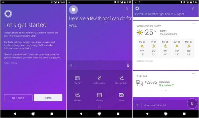
The battle for the digital personal assistants is in full swing, and one of the secrets to winning it is to be available in as many platforms as they possibly can. Cortana is of course the official one for Microsoft but for the past few months, it has been available as a preview app for Android in India specifically. Now the app is getting a refresh and for version 2.1.6, you get a brand new User Interface and look that should make it more interesting for those looking for something other than what they’re already using.
The app is actually available in four different colors: purple, blue, green, and grey. It now has bigger text for those who may have found the previous one too small for their reading pleasure. The hamburger menu has also now disappeared and been replaced by a grid for quick actions, which some actually find better than a list on the hamburger pane. And it’s not just the design that has been improved but also the performance as it is now supposedly faster and smoother than before.
The changelog also indicates that you can now create a new account using your mobile number and SMS code, for new users of course. Location detection has also been improved, which is important for those features of Cortana that are location-based.
Cortana for Android preview or CoA Preview as stated in its Google Play page, still has its usual personal assistant features and can keep you updated on your schedules and appointments, reservations, flights, bill payments, and other important information. No news yet when the preview for other locations will arrive.

VIA: ONMSFT


