And the updates just keep on rolling from Microsoft and its various digital properties. Just a few days ago, we saw new features and changes added to Bing, Cortana, and the Next Lock Screen. Now it’s the turn of Android device launcher Arrow and cloud-storage service OneDrive. You get memory efficiency and customization options for the former and sorting and parsing improvements and new visuals for productivity for the latter. The updates may not be that major, but we’ll take improvements any day of course.
For version 2.7 of Arrow Launcher, you will now be able to search easier and all you have to do is to swipe down. You will also now be able to customize the grid layout of your app page. You can choose from 4×5 to 4×6 and other options so you can arrange your apps the way you like it. You will also be able to customize the content you want displayed in the recent page. You of course get bug fixes and improvements, including a 10% more memory efficient performance.
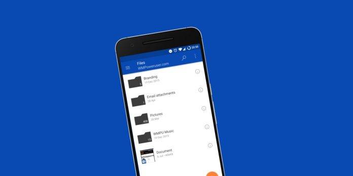
If you store a lot of files on your OneDrive, sorting through all of them can sometimes be a pain. The update to the cloud-storage app says that it will make it easier for users to sort and parse through all the tangled files that you saved there. What it doesn’t tell us exactly is what those changes are. They have also added more paintbrushes and pencils to help you be more productive, again without getting into specifics.
Both updates are already rolling out, so if you use either the Arrow Launcher or OneDrive, head on over to their respective Google Play pages and update the apps. If it’s not there yet, just be patient and it will probably reach you sooner or later.


