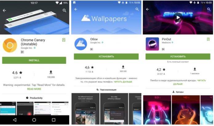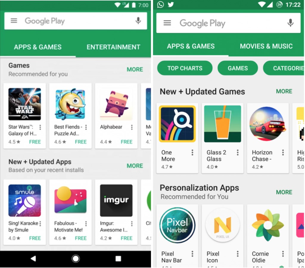
We’re not really sure if it was just careless filmmaking or it’s actually intentional, but a recently released video showing off the Google Pixel actually also “leaked” what the Google Play Store will look like once an update has been rolled out. And since Google has been known to experiment and test out things before they officially roll out, several users have now been seeing the new UI and interface, and it looks like the update will be much better than the current one.
Those with eagle-eyes noted that in the Google video, the UI of the Google Play Store was something they haven’t seen before. And now, some users have reported that their accounts are reflecting this new Play Store vibe and from the initial reactions, it seems like people like it. The most obvious is that it has a new color scheme, which is basically a darker shade of green than what we’re used to in GPS. We don’t know if it’s in preparation for Christmas season or something.
Some of the other obvious changes includes a bigger Install button, which apparently now takes the whole width of the screen, instead of just a small bar on the right side. The ratings of the app as well as the number of times the app has been downloaded is also now much easier to understand, while the category of the app has also been moved, and it’s now centered and a little bit lower. It is much better to see what kind of app it is that you’re looking at.
We have no idea yet as to when theses changes would take into effect, or if they even will see the light of day. But we hope it will since based on the screenshots, it does look pretty good. Let’s wait and see for a Google Play Store update and if these screenshots are accurate.

VIA: Android Police


