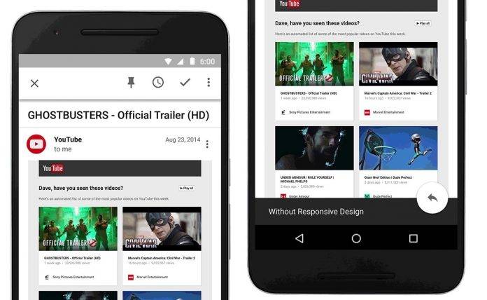
Reading emails anytime, anywhere can be a delight to some people. It’s actually practical and having your inbox with you has made work and productivity even better. You can quickly check your email or wait for a notification to arrive before you can open a message. Email is pretty convenient but not all messages look nice for reading. To solve this issue, you can edit emails in a much nicer format.
That’s easier said than done because we don’t really have control over the emails we receive. More often than not, email format shows small text, links, or buttons. Reading can be a challenge because in reality, messages are formatted for bigger screens.
We all know that an app looks better if well-designed or optimized for a particular screen. Mobile websites and apps are now required to be more “responsive”. And finally, someone acknowledged that even email design must be responsive so messages can adapt to any screen.
Google made some significant changes to Gmail and Inbox by Gmail apps. Emails created with responsive design will soon be supported. The idea is that text, links, and buttons will become larger when reading a message. This way, you can easily tap on any links especially when ready on a smaller display. Emails created for mobile will also have no problem being viewed in bigger screens.
The goal is to make reading more intuitive and more comfortable. For email designers, new CSS rules are being set for you to use. Google and Gmail developers are preparing such rules and some are already available HERE. Hopefully, this CSS support will allow designer to have better control of the messages and how they are rendered on every screen.
SOURCE: Gmail Blog, Google Apps Developer Blog


