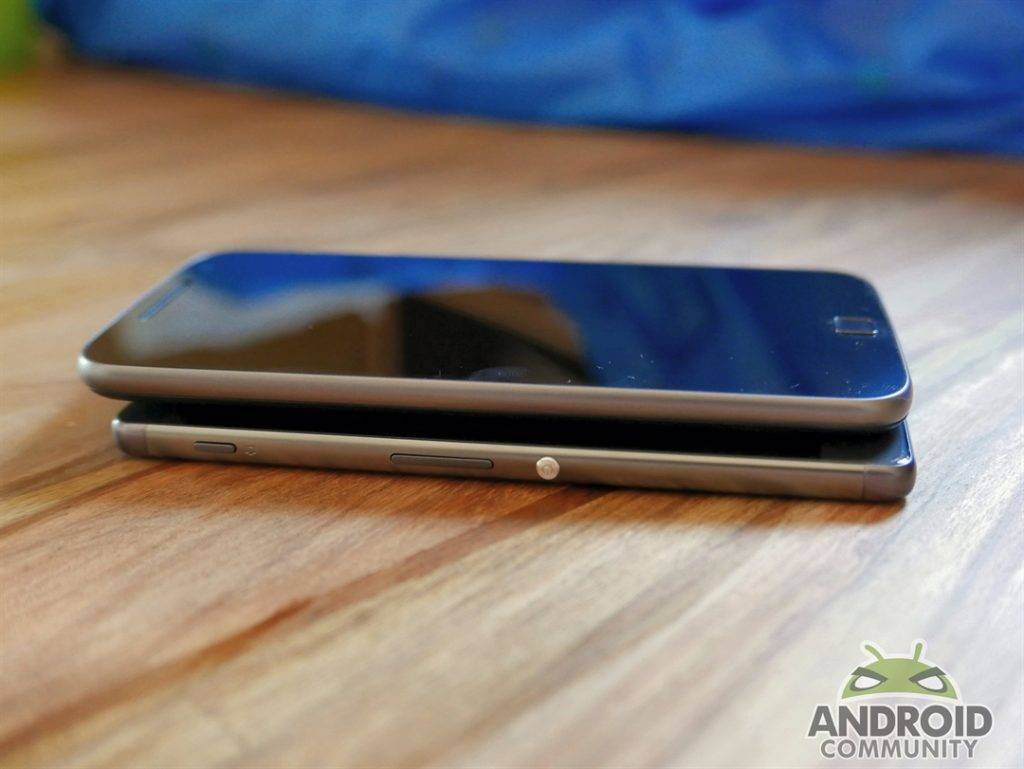
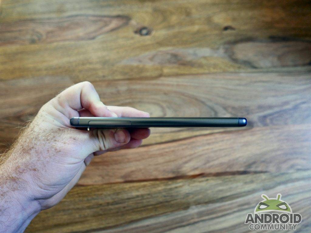
It’s no longer enough for a mid-range phone to simply be budget-friendly – it also has to look good in your hand. After years of muddling through with so-so designs, Sony has stepped things up with the Xperia XA, a device that makes use of an edge-to-edge screen that slices off the bezels and brings a bit of ‘wow’ back to the brand. Not only does the Sony Xperia XA shine in terms of style, but it also feels well-built when you hold it, with its plastic body right-sized for single-thumb typing and its 5-inch diagonal screen offering decent real estate for your eyes.
Unfortunately, dig a little deeper into the Xperia XA’s details and it becomes clear that the rest of the phone has trouble keeping up with its first impression. Let me be clear: there’s nothing specifically ‘wrong’ with the XA from a performance perspective, but when evaluated against other devices at its price point it’s harder to justify choosing the Sony over several of its rivals.
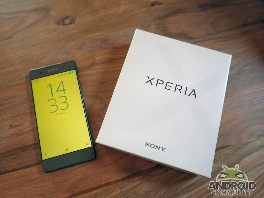
That 5-inch screen I mentioned above offers 1280×720 resolution with 294 ppi, which is acceptable but not great – and outdone by less expensive phones like the Moto G4’s 1080 display. The lower resolution of the Xperia XA’s display is somehow compounded by the edge-to-edge nature, as you simply expect more from such a graceful design. You’ll ‘get by’ with the XA, but pictures and text tend to get a little fuzzy around the edges at certain viewing angles, and there’s nothing dazzle about color reproduction either.
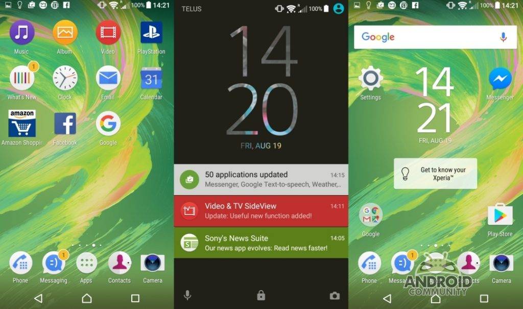
Under the hood there’s a 2 GHz octa-core MediaTek Helio P10 processor working with 2 GB of RAM, paired with 16 GB of internal storage and running Android 6.0. It’s a relatively stock version of Marshmallow, which I always appreciate, but it’s slowed down by the bloatware that Sony has packed into the device. Most of it comes from the mothership and is intended to link you to other Sony properties (such as Playstation), but there are a few third-party apps to be found pre-installed as well. Numerous times I had to deal with slow loading apps or long boot cycles because the Xperia XA was updating yet another built-in app I never use. Remove as much of this as you can and you’ll be happy with the XA’s performance (and not as confused by the icons scattered around the home screen).
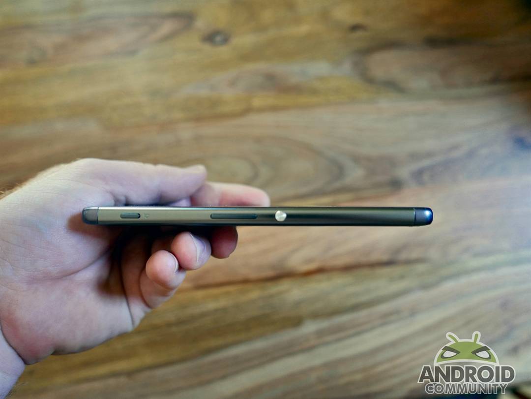
Uninstalling the pre-packaged apps will free up storage space so you can maximize the small 16 GB the XA has to offer without forcing you to tag in its SD slot. You’ll also probably use a lot less battery. The 2,700 mAh claims two days of idle time, but I noticed it draining a fair bit quicker than that, and made sure to have the charger nearby whenever I traveled with the device.
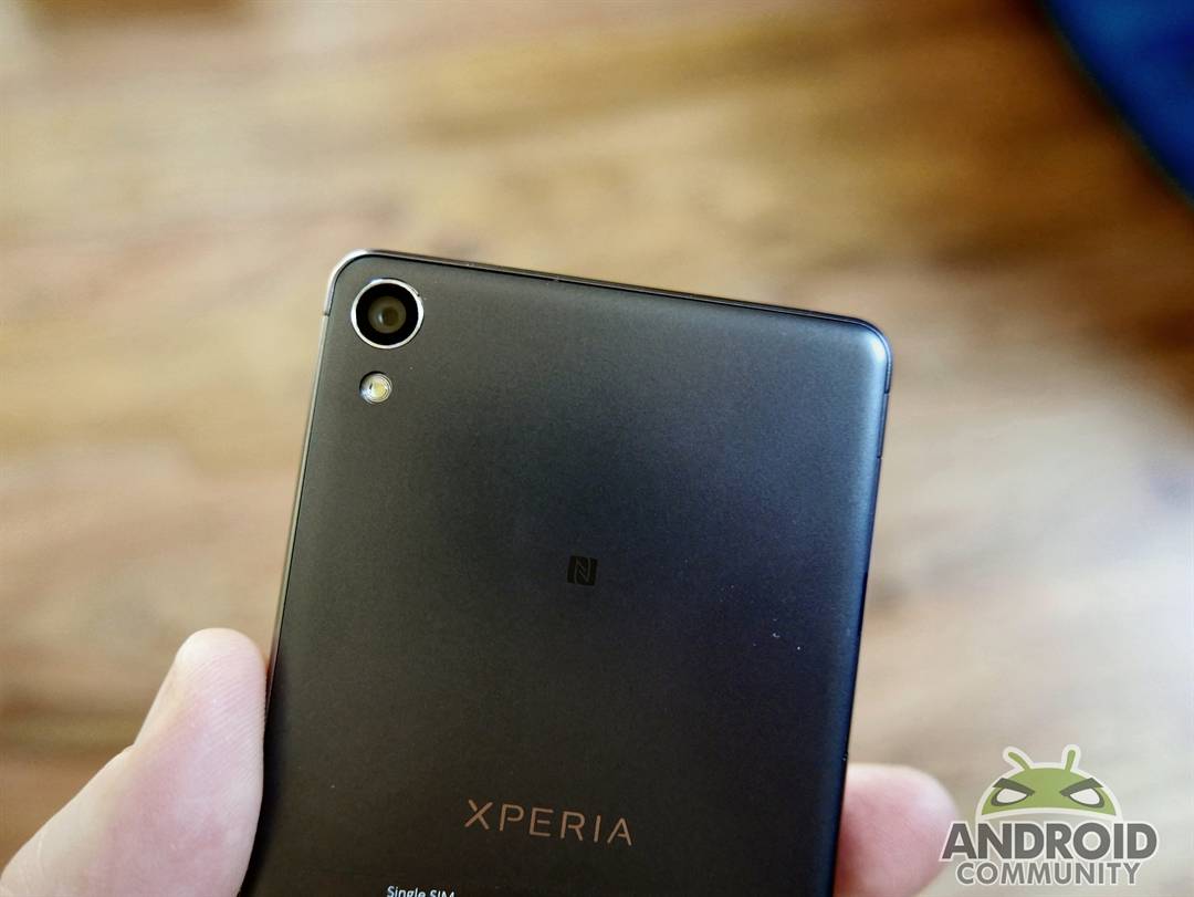
Cameras check in at 13 megapixel (front) and 8 megapixel (rear), and photo quality is in general quite good at most light levels. Don’t look for 4K video, though (which you’ll find with the OnePlus 3 and the Moto G4). Also missing: a fingerprint scanner, which is quickly becoming a must-have solution for phone-based payment systems and general convenience, and waterproof components.
The Sony Xperia XA is an ‘OK’ phone that looks great but is simply priced too high for me to recommend it over the alternatives mentioned in this review. Listed at $249.99, it’s outperformed by devices checking in at least $50 cheaper that provide double the storage, a more robust design, and a longer list of features.


