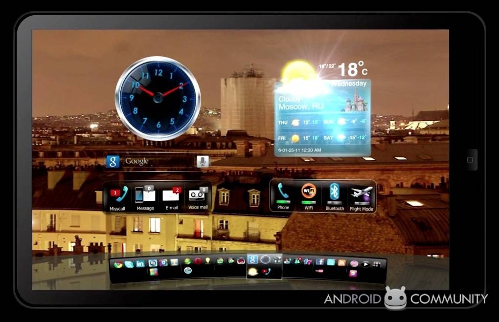
Google is doing its best to dissuade Android OEMs from modifying the Honeycomb UI on tablets, but that doesn’t mean it’s necessarily the 3.0 way or the highway. We’ve already seen software fettler SBP‘s custom UI work for Android handsets; now the company has sent us some videos of its new Tablet UI Engine.
As before – and to the frustration of many interested users – SPB doesn’t plan to offer end-users either UI, only OEMs. They’ll be able to customize the layout and the widgets, adding in their own content and carrier-specific tweaks to differentiate the interface as they see fit.
Four different default layouts are demonstrated, including a basic three-pane UI of app shortcuts, widgets and a task manager, a 3D side-scrolling panorama similar to Honeycomb’s native interface, and a pinch-zoom navigated “underwater” theme. In a similar vein, a “universe” theme which moves through a 3D stack of apps and widgets might be more suited to a single-point touchscreen.
SPB couldn’t tell us the names of the OEMs and customers it’s working with, but we’re told interest has been very strong since the company began showing off the UI concepts late last year. That could mean we’ll see more customized Android slates in the very near future.
[vms c69b48737cc0c92d0f3a]


Looks good.. but, the concept has a lot of Windows related items (Outlook, Internet Explorer, etc.) I wish they would have thrown in the actual Android stuff.
Looks good.. but, the concept has a lot of Windows related items (Outlook, Internet Explorer, etc.) I wish they would have thrown in the actual Android stuff.