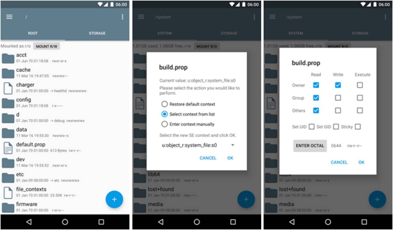
Even the most utilitarian of apps needs a makeover every once in a while. Root Explorer, the file manager for root users, isn’t the prettiest of apps, and if you’ve been using it, you know that it’s not that big a deal for most, as long as it’s working. But the latest update puts a bit of charm into it as version 4.0 brings a long overdue design makeover for the app. And not surprisingly, of course it’s a Material Design makeover.
The only entry in the changelog of the app are the words Material Design, and if you’ve noticed with the past apps that have adapted Google’s visual guidelines, you know it’s already a big change for any app. It’s a welcome departure from the Holo interface which has served it well but is now needed to change. The update has improved the readability and layout of course of the app.
Some of the other changes that have occurred include the choice of either light or dark themes for whenever the mood suites you. The “sort order” and “view order” commands are actually now in the main drop-down menu instead of the Preferences menu. So it should be easier to sort through all the files that you want to look at.
There seems to be no gradual rollout for the update so you should expect it to be there if you have the app already. If you don’t yet and you feel like you need to have access to the whole file system of your Android, you can download Root Explorer from the Google Play Store for free.


I don’t like this new material design. Pitty that is no option/version without it. I stay with my 3.8.x version.