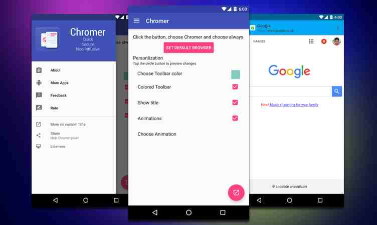
Last December, we told you about an app called Chromer that lets you have a Chrome-like experience when you open a link in whatever app you’re using. Now the developer has released an update, version 1.5 which he says is the biggest since he released the first version of the app, 1.0, late last year. Now you get to have webheads (floating bubbles), the chance to share it with the app you use the most, and a dynamic tool bar that matches the color theme of whatever app you’re using.
Inspired by floating browsers from apps like Link Bubble and Flynx, the webheads feature of Chromer lets you open multiple links and stack them on bubbles so you can view them later on. The one on the top is of course the most important, but you can rearrange them in the order you want. You can also set it that once the link has been opened, then the bubble will close. The developer also integrated physics based web animation so it would look nice.
Another new thing that comes with the update is that now you can use your favorite sharing app and make it the default action. For example, if most of the links you open are saved to Pocket, then you will see the pocket icon so you can save the link quickly. You also now have an enhanced dynamic toolbar wherein Chromer will try to match the color scheme of the toolbar of the app you’re using.
The update also brings a lot of other improvements to the earliest version of Chromer. You can wait for the update to roll out through the Google Play Store or you can download the APK if you can’t wait anymore.
SOURCE: +ArunKumar


