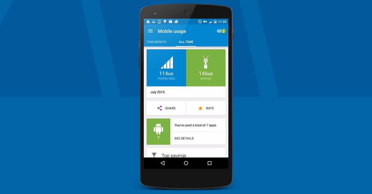
Even the most practical of apps need a design makeover every once in a while. Data management and data saving app Opera Max has undergone one, and the latest update to the app brings improvements not just in the app management functionalities, but also the aesthetic and functional design as well. And all these changes come from user feedback or most requested features from users. It’s always a good thing when developers show their users that they actually listen to their suggestions and requests.
First off, the look and feel of the app has now been more or less streamlined, using the Material Design visual guidelines that Google has suggested to app developers on Android, specifically for the summary cards. It also helps distinguish if you’re looking at your mobile or WiFi timeline. When you want to disable certain apps from using your mobile or WiFi, it is now easier to do so with the new toggle controls. Just tap on any card in the timeline and then you’ll find the new app-blocking widget.
There are also several app-management improvements that comes with the new update. You can now set different saving levels for either your mobile savings or your WiFi savings. There is also now a savings tab in the app blocking section where you can manage easily which apps can use or be excluded from the Opera Max savings operations. And if you want to see the total amount of data you’ve used and saved since you started using the app, you can now do so with the All-time section.
They were also able to fix some problems encountered by users using the the traditional Chinese translations. The update has been rolling out to users so you can check yours on the Google Play Store page.
SOURCE: Opera


