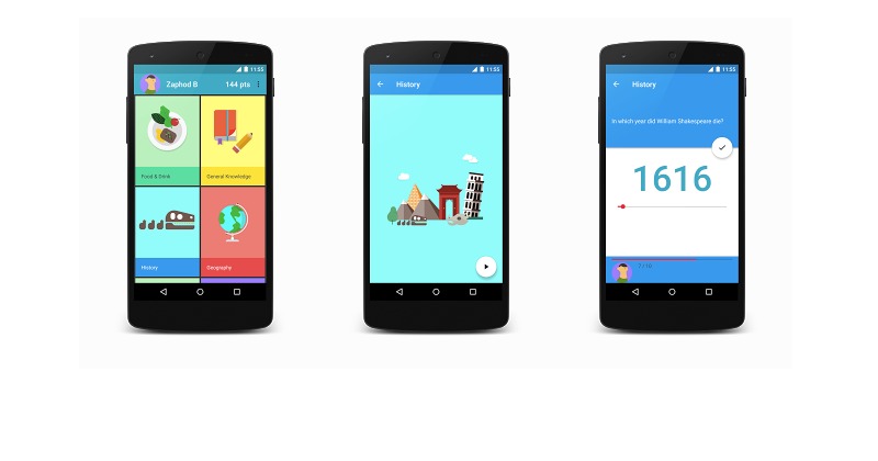
The Topeka app for Android has just received some Material Design updates. It’s a special app that was launched by Android developers to work as an open source of example material design on the web. This time, the app gets another Android version. It’s still the same app that demonstrates the same material design guidelines and branding–all of which can be used to create a consistent platform experience.
Material Design principles are now known to most Android devs. Some more important and interesting features focus on Transitions as provided by the Transitions API within ActivityOptions. This way, transitions between activities are more fluid and smoother than ever. Check the CategorySelectionFragment code for multiple transition participants with ActivityOptions.
Another notable improvement is on animations. You can now orchestrate your own animations as long all elements and subjects are well=choreographed. Animation now starts with color changing for the floating action button. Notice the scale animation shows the button shrinking out. The question view might also move offscreen if you scale the view to a smaller green square. Feel free to check out AbsQuizView’s method, the Floating Action Buttons, and the FAB working on two surfaces with different heights.
Material Design on Topeka Android means you can build a more convenient and better exprience across the web and your Android devices. You will also notice the Android 5.0 SDK plus the new Android Design Library. Topeka only supports an API 21+ but more people are expressing their love for the earlier versions.
SOURCE: Android Developers Blog


