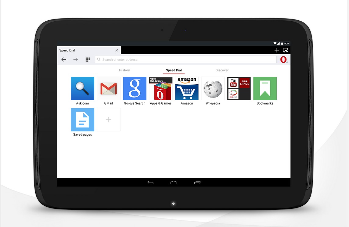
There are a certain number of users that would much rather use browsers other than the big 3 (Chrome, Firefox, Safari) on their mobile devices for various reasons. One of the “lesser known” but also popular ones is Opera for Android. The latest update to the app is bringing you several improvements, including Opera Turbo, the ability to sync tabs across all the Opera browsers you’re using, and text-wrapping those pesky websites that are still not optimized for mobile (seriously, what are you waiting for, websites?).
Simply put, the Opera Turbo mode saves your smartphone or tablet from consuming too much data while at the same time, it won’t sacrifice the layout or functionality of the site you’re viewing. Previously, Opera had an Off-road mode which reduced data but also brought several site-compatibility issues due to reducing Java support and also architectural limitations. But they have now replaced Off-road with Turbo, and the compressing and page rendering of the web pages happen on your phone so everything should be compatible, including animations, complex interactions, etc.
If you use Opera on other devices, you will also now be able to sync all the tabs you’ve opened, so that switching from your smartphone to your tablet and/or to your netbook will be much more convenient and you won’t lose any of your opened tabs. There should be a tab switcher button on the bottom left corner of the browser. There are still some websites that have not yet optimized to mobile for some reason and it’s really annoying to pan from left to right when reading them. Opera now has an automatic text-wrap by default with the maximum paragraph width adjusted to your device’s screen already.
The update should have rolled out to all Opera for Android users now, which of course has the usual stability and usability improvements as well. If you haven’t been using this browser yet, why don’t you give it a whirl by downloading from the Google Play Store.
SOURCE: Opera


Sorry but on Android Opera is one of the big 3 with at least 500+ million downloads just for the standard Opera.. There’s also Opera Mini as well.. Also UC Browser is right up at the top.
The new interface is a pain in the ass to use.
Overall the buttons are small and crammed up against screen edges.
And if you are using the mobile or “classic” interface, the tab switcher can only display 3 tabs at a time, and is dreadfully slow to drag around.
Frankly the “classic” interface seems like a poor joke next to the interface of the actual classic browser (that Opera now seems to have removed from the Play Store).