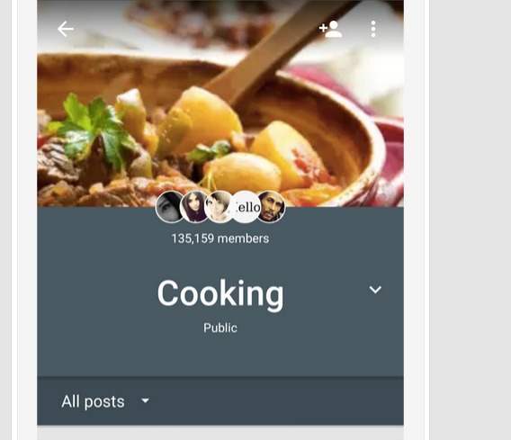
While we’re still pretty unsure how Google+ will eventually play out, given the changes that have been happening to a number of Google-related products, that does not stop their developers from making changes and improvements to the app. The latest aspect of the social network to receive a make-over is its Communities pages, bringing the ubiquitous Material Design animation and some other physical changes to the page.
If you’re just using the usual Google+, you won’t notice any changes at all. But if you’re a member of any of the Communities and head on over to that section of the network, you’ll notice that it looks distinctly different from the rest of the page. It differentiates itself from the main Google+ stream so you’ll definitely know that you’re in a “different place” when browsing through your Community page. It also gives you a new Material Design animation that is evident when you pull down from the top page.
Ever since Bradley Horowitz stepped into Google+ and started handling the Photos and Streams, people have been speculating that huge changes will be happening to the social network, particularly since it has been performing way below expectations. The inclusion of Google Drive in the last update, where you can now view your photo stream into the cloud service as well, has confirmed that big changes are afoot. While this new update may not be a big change, it is still worth noting.
The animation changes are not yet evident when you update your Google+ to version 5.3. You also need to install the new version of Google Play services, which is version 7.3.27. Then don’t forget to restart Google+ for the changes to take effect.
SOURCE: +Google
VIA: Android Police


