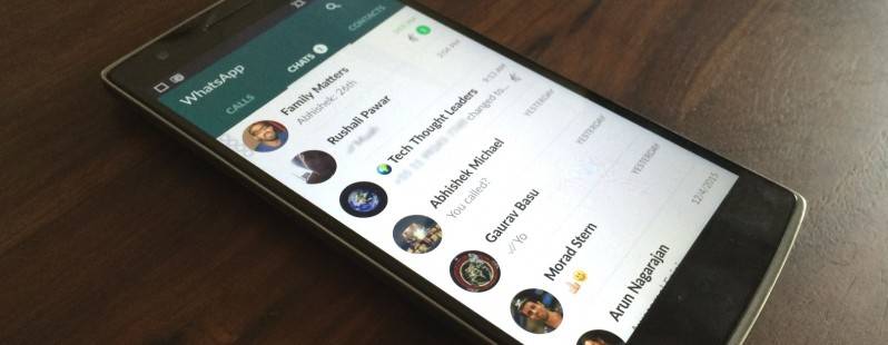
It may be a little late to the party, but from the looks of it, the wait may be worth it. Popular messaging app WhatsApp has finally received a Material Design make-over as well as a much-improved layout and new icons. The update actually hasn’t rolled out yet, but the APK is already available, in case you can’t wait to see the effect the changes will have on the way you communicate with your friends.
One of the most noticeable changes when you’ve updated is that version 2.12.38 now sports a dark green title bar which has three tabs: Calls, Chats, and Contacts. The Chat window also has a new feature, the option to record voice messages, which can also be found in the pop-up for attachments. A lot of the previously cluttered and dark-looking areas are now simpler and cleaner, and it looks nicer as well. Your group chat cover images are larger (so you better choose nicer pics!) and it minimizes to the title bar with the dominant color from your cover photo.
When you select photos or videos to share to your contacts, the layout is now cleaner, making it easier to choose the media you want to send. The new icons for search, new call, new message, and settings have all been changed to white and you get a white bubble indicator next to either the call or chat windows which shows how many unread messages or missed calls you have.
There are a lot of subtle changes in animations, although some of them are reportedly not working as smoothly as it should. Maybe they’re still trying to fix the bugs before rolling out the OTA update. In the meantime, you can download the update from the WhatsApp site itself.
VIA: Android World, The Next Web


