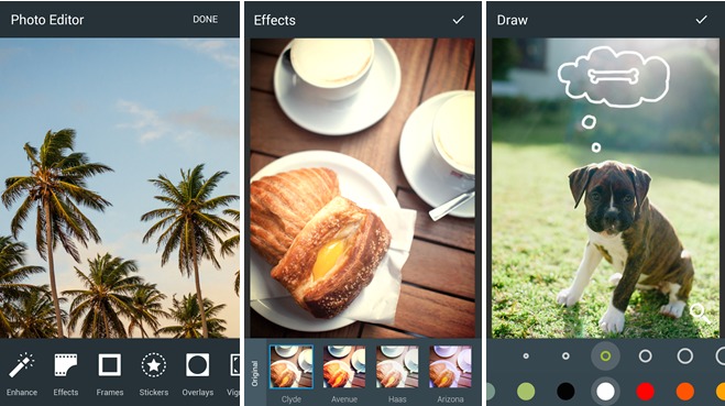
Mobile photo editing apps are pretty convenient, but can also be tricky since retouching photos by touching is a touch and go situation. But there are apps who seem to have gotten it mostly right, and one of those is Aviary (which was bought last year by Adobe). The latest update to the editing app brings with it Google’s Material Design visual guidelines, and it has also brought improvements to the UI and to the over-all user experience, making it even easier for you to edit your photos on the go.
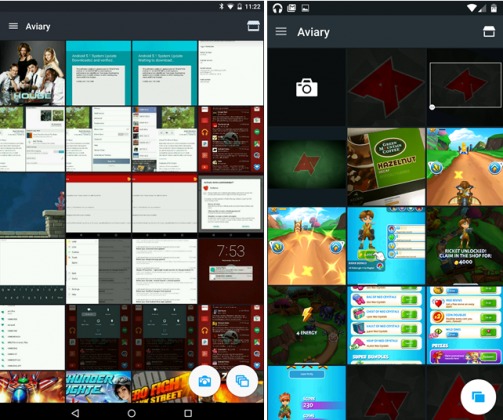
The changes may not be as plenty, and sometimes may not be as obvious, but if you look really hard and when you use it a lot, you’ll notice that they have improved. There are no more “favorite” bookmarks for any of the features like Effects and Frames, and so they are all on equal footing with the other tools in the app. The camera button used to be a floating icon, next to the recent images one, but now, it’s an integrated button in the grid, which is the first item you’ll see.

The editor now sports all new icons, paper-like layers, and tangible surfaces. When you’re editing a photo, you can now pull the sliders, loaders, and color options from the draw and text tools. There are more subtle changes, but all in all, the developer says that all this is to give you “an even easier and more pleasant experience” when editing your photos.
The update should be rolling out to users. If you want to manually do so, you can head on over to their Google Play Store page.


