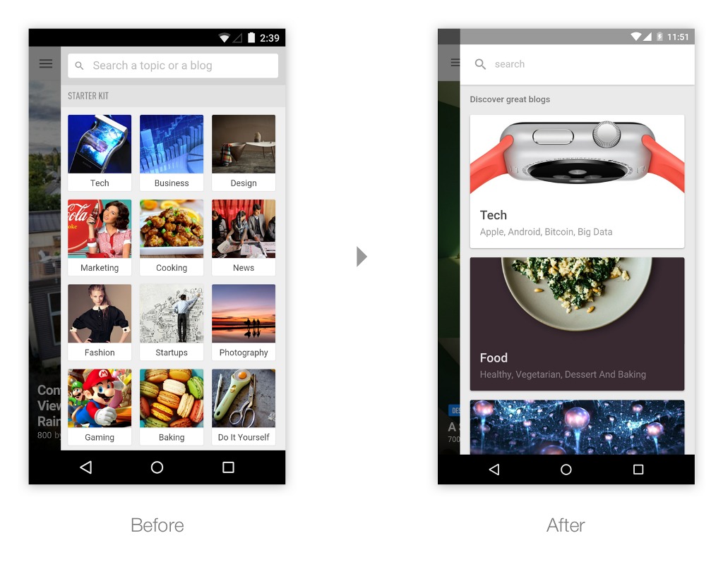
A lot of similar news-feed apps have already adapted to Google’s Material Design visual guidelines, but the folks over at Feedly wanted to take their sweet time. They’re now talking about the process they went through when coming up with their app’s redesign, which has now started rolling out into the Android smartphones and tablets. With the guideline to make it “more emotional and immersive”, they are now showing the digital world the app’s first implementation of this ubiquitous (but very pretty) Material Design.
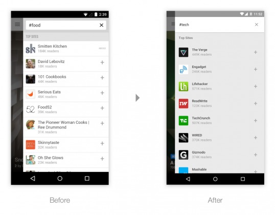
Feedly’s Explore screen used to show us an image grid of several topics that you might be interested in. But they have now changed them to bigger and bolder visuals to give you that immsersive feel. Under the topics card, they’ve also listed sub-topics, 6 random at first and then smaller cards for other topics. For the Search section, the flat list from the previous version didn’t really showcase what the blogs were about so people had a hard time choosing. They have added a collection sharing feature where thought leaders on different topics shared which blogs they will recommend. It even has an Add All button if you trust the curator enough to follow all his/her/their recommendations.
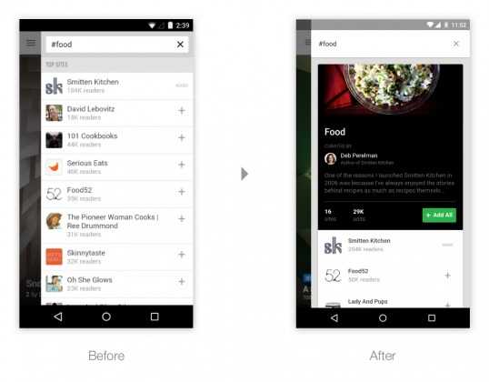
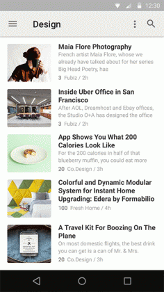
Even the sidebar, blog lists and other basic stuff on the app have now been redesigned with Material Design in mind. The animations are a little bit trickier and they worked with one of Google’s motion designers to come up with a great one when opening and closing articles. Unfortunately, since it’s a bit more complicated, they didn’t include it in this update yet.
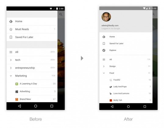
The update to Feedly is rolling out to its users starting today. It might take some time to get to you, but with all the thought and time they’ve put into this, it might just be worth it.
SOURCE: Feedly


