Long before there was Inbox by Gmail, the whole app that started us going for a zero inbox as one of our digital goals was Dropbox’ own Mailbox. When it finally arrived on Android devices, we were quite pleased that getting rid of those 2,000+ emails was going to be easier now while using our mobile gadgets. The latest update to the app now makes it look like a true-blue Google app, at least in certain aspects.
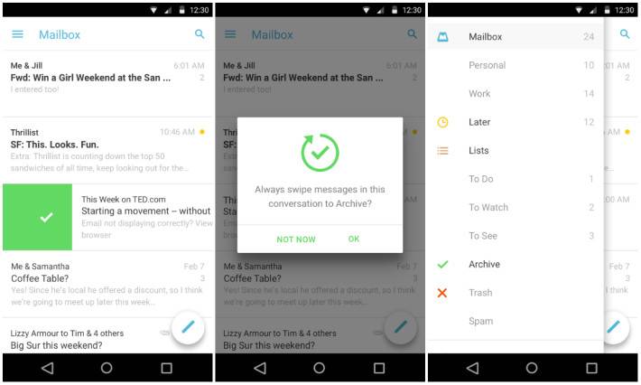
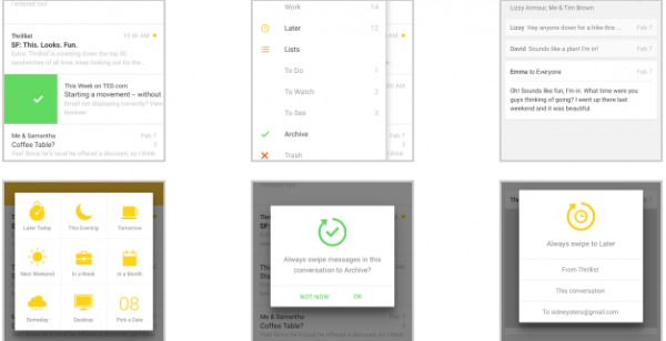
The biggest change for Mailbox is the fact that, like many Android apps for the past year, it has received a Material Design update. So everything looks cleaner, lighter, even whiter (although white is the main color of the app from the very start). The user interface has slightly changed, with the most obvious one being it now has a floating button that will make it easier for you to compose a new email. It also now makes your slide out navigation drawer reach the top screen, which makes it look more like a floating layer.

It is also now easier to search through your email as the search button is on the top right corner, unlike before when it was still somewhere in the navigation drawer. They have also removed the Snoozed/Inbox/Archived button tabs to make it look cleaner. When you type your email, you can now display your email signature as well.
If you haven’t tried Mailbox yet, you should check it out to see if you can swipe your way to a zero inbox, without needing to go to your desktop and choosing the mark all as read button blindly. You can download it for free from the Google Play Store.
VIA: Android Authority


