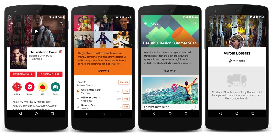
No need to wait that long for immersive mode to arrive on your Android Lollipop-powered device because Google’s user interface engineer Kirill Grouchnikov himself shared on his Google+ page some immersive previews as shown in Play Store. These images give us an idea how the new Google Play Store will look with a transparent status bar on Lollipop devices. According to Grouchnikov, the changes have started to roll out onto Google Play over the weekend. Don’t be too excited though because these enhancements are available for Lollipop users only.
The changes are not that big but you’ll notice something new. A transparent status bar will show when you view listings. You’ll notice hero images for listings too inching higher on your smartphone’s display slowly. As a result, there’s less need to scroll because more information can be shown below the images. The bigger the space, the more details about a particular app can be displayed.
Again, this update is only for Android Lollipop users.
SOURCE: Kirill Grouchnikov


