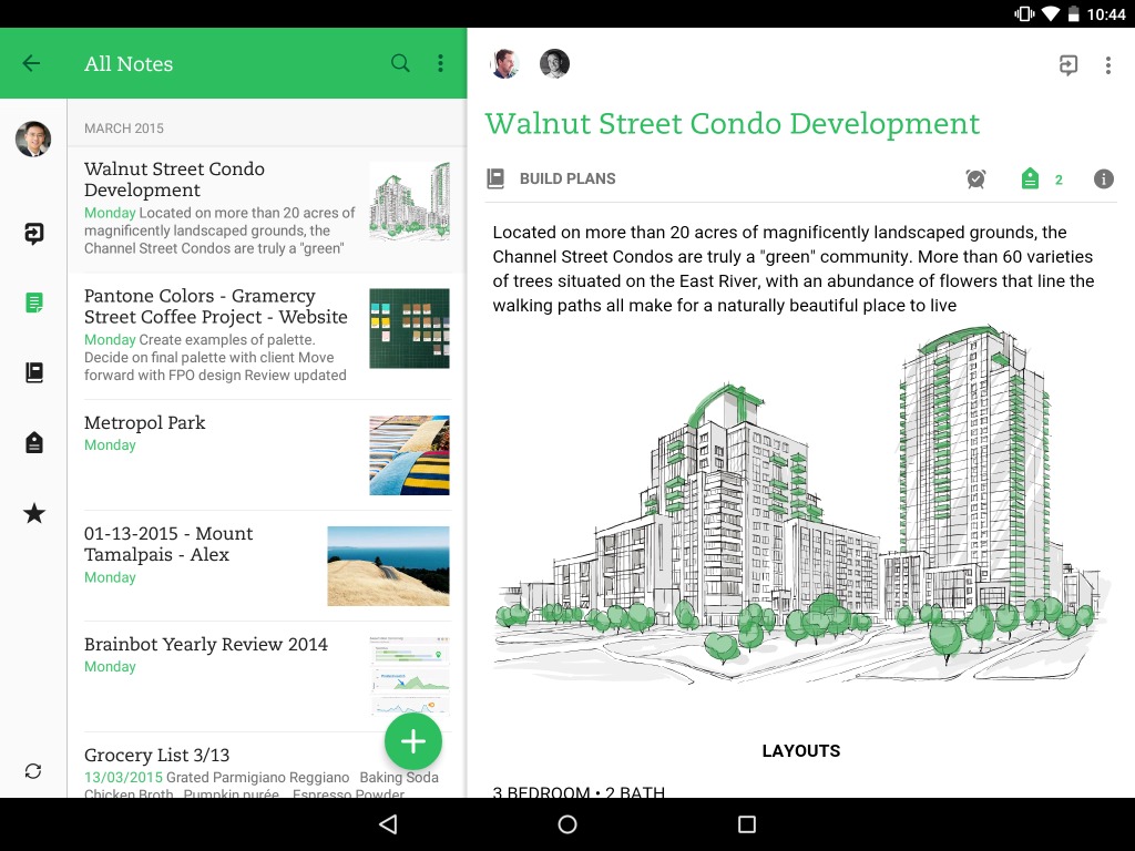
When Evernote 7 first came out for Android smartphones almost a month ago, users were pretty happy with the Material Design update, new collaborative features, and user-requested enhancements. But of course that was created just for the smaller screen and those of us who used tablets more often to access the note-taking and productivity app wished that it would also be optimized for larger screens. Well, they took their sweet time and now they’re finally bringing the latest update for Android tablets.
The “flatter look, bolder colors, and improved typography” can now also be found on your Evernote app installed on your tablet. The developers were going for a unified experience, whether you were using it on your smartphone, smartwatch, tablet or desktop, but at the same time, optimized for whatever device you’re accessing it from at that moment. The tablet version now a split toolbar which lets you manage your content while doing certain actions at the same time. The main navigation panel can still expand and collapse so that it will be easier to access your notes, to-do lists, links, etc.
There are also subtle improvements on the typography and alignment, which you’ll probably only notice if you have a keen eye for details. But eventually as you use the app a lot (which you should!), you’ll realize that these minor improvements contribute to a better experience when using Evernote on a tablet or larger screen.
The update should have rolled out to your Evernote by now. Every update to this productivity app is something we always look forward to, and we hope the next one is just as good, both visually and functionally.
SOURCE: Evernote


