MWC 2015 isn’t enough to keep Google from doing its weekly update duties and this week, we’re getting a taste of quite a few big ones. And now, this time it isn’t just about Material Design, but the changes do improve on the overall user experience as well as the user interface of some apps. Play Store gets a new and better landscape layout, Hangouts gets a new contact card format, and Drive adds drag and drop organization on mobile.
Google Play Store 5.3.5 (APK)
Up until recently, Google Play Store wasn’t really the prettiest. The Material Design makeover took care of that except for one glaring error: landscape orientation. Content used to stretch from edge to edge of the available space. Not exactly Material Design-like. Well, that’s now fixed.
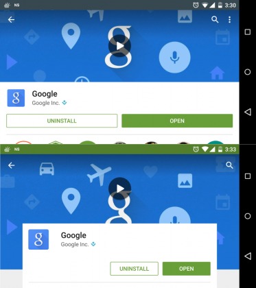
Another Material Design transgression is the action bar, which remained visible even while scrolling through content. Now That piece of user interface automatically gets out of your way while reading and returns once you scroll up again.
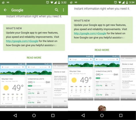
Notifications are another thing that has changed. Now it has its own section in the Settings page, where you can choose to be notified both by available updates as well as when automatically updated apps have been updated. And speaking of notifications, you will also be able to Update or Update All apps right from the notification entry without having to go into Play Store.
Hangouts 3.0 (APK)
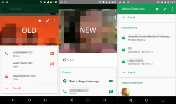
Despite the big jump in version number, from 2.5 to 3.0, the changes in Hangouts are more minimal and more subtle compared to Google Play Store. While there are small stylistic changes left and right, the most substantial one has to do with the contact information. Whereas before, the information displayed in contact cards are quite basic, now they include more, including the person’s conversation history with you as well as other contacts you have in common. This mirrors the recent changes Google introduced into its web browser Contacts page.
Drive 2.2 (APK)
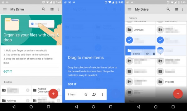
Last, but definitely not the least, is Google Drive, which goes from version 2.1 to 2.2. This time there is almost no change in appearance, except for a subtle Material Design correction, but there is definitely one big change in behavior. Like on its web browser counterpart, Google Drive now allows moving files into folders using a drag and drop gesture. That might not make much sense on a touchscreen, but Google does try to make it a bit easier, also by including a short tutorial once your app has been updated. You basically tap and hold on a file or folder in order to add it to a queue of selected items. You do that for each and every file you want to move to the same place. Once you’ve had your fill, you then simply drag and drop the files where they belong.
The updates to these apps have started rolling out to some users. As with other updates, it might take some time before it reaches you. Or if you really can’t wait to get the latest, simply click on the APK downloads for each app above.


