In Part 1, we took a look at how some iOS 8 features looked nice and perhaps were even better than their Android counterparts. But being Android Community, we will not be content to let it end there. In this part, we will try to find ways to have those features, or at least a semblance of those, on Android. The good news is that it is all perfectly possible, given a few caveats, of course. And that’s all thanks to Android’s nature of openness and reusability.
There are two ways we can go about this adventure. The first part involves adding features to Android’s notification drawer. Though this way is somewhat cleaner, depending on your definition of “clean”, it is also quite limited. The other method employs the use of having additional drawers that can be invoked anywhere, even inside apps. It opens up more possibilities, but can also be a bit more complicated to use.
To keep things a bit fair, we’re doing this experiment on a Nexus 5 running Android 5.0 Lollipop, just to match the most recent iOS version as well.
The Notification Draw Way
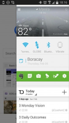
iOS 8’s notification drawer separates notifications themselves from a “Today” tab that can hold relevant timely information as well as widgets. But unless you’re an OEM developer, you probably only have access to what Android has, which, in Lollipop, is a unified drop-down drawer. This method involves putting apps that masquerade as permanent notifications, giving you access to information or shortcuts as needed. Among other things, the iOS 8 Today tab has your time and date, weather, calendar appointments, and sometimes shortcuts to app actions like Evernote and Todoist. Android has the time and date down, so we need to only figure out the other three.
Notification Weather (Free)
Notification Weather, as the name says, puts weather information available at a glance from anywhere in your Android phone. You can have it for a single day or you can opt to show multiple days, at the price of more screen space. The app itself is quite straight-forward and the options are pretty basic. One setting to note, however, is the Priority level. This determines where in the stack of notifications it will sit. The Maximum setting will ensure that it will always be on top, which is good if you want it to be there.
Status Agenda Beta (Free)
Perhaps more than the weather, people will most likely want to know what’s on their schedule for the day. Status Agenda puts that information again at your fingertips, no matter where you are or what you’re doing, which is the advantage of these types of apps. This app’s settings are even more basic. You can’t even set the priority for its notification, which means it will sit at the very bottom of the stack, which is actually probably the most ideal place for it.
Notification Shortcuts (Free, Unlocker $0.99)
OK, iOS doesn’t really have a space for app shortcuts on its notification drawer, but Android does. Except in Lollipop, it takes more than one swipe to get there. Sometimes, you just really need a quick toggle without having to think of it too much. That’s where Notification Shortcuts come in. It is closer in purpose and appearance to Samsung’s TouchWiz quick toggles but, of course, more general purpose. You can assign shortcuts to apps, to toggle settings, or even to special actions. You can decide how many items to fit in each row, 7 maximum, but you can also have more rows if you buy the Unlocker for $0.99.
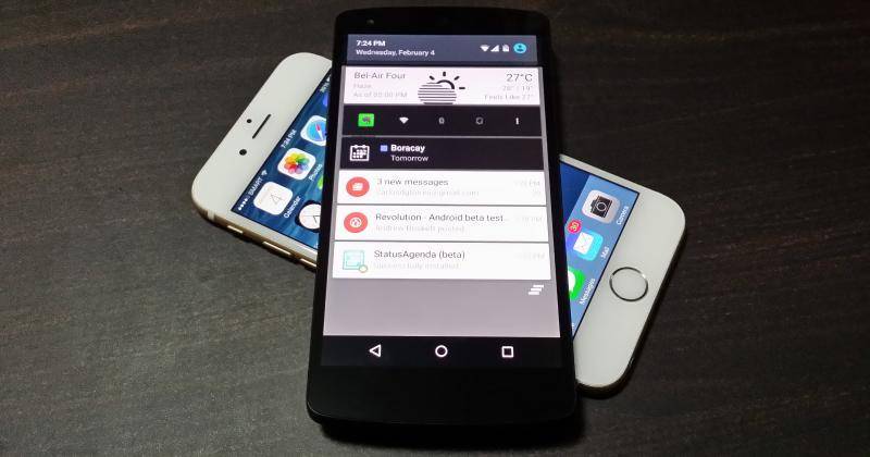
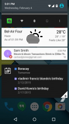
When used together, these three will make your Android Lollipop look like this:

It won’t be the prettiest or the tidiest notification around, but it works for the features you might want. Not that Android 5.0’s notifications are the tidiest anyway. There are three disadvantages to this method though. The first is probably just a minor annoyance. These apps will, by default, put a notification icon on your panel, because, after all, they are notifications. Some have ways to turn those off, others only make them transparent, leaving a hole in your panel. The second is that, since this isn’t a supported way of (ab)using notifications, the order might change from time to time, unless you set them to Minimum priority, in which case they will always sit at the bottom. And last, there is only so much you can do with stretching notifications. You can have shortcuts, but no actions. And no widgets, which may sometimes be a prettier way to set all these up. Which brings us to our second method …
Sidebars!
Since the beginning of time … OK maybe not that far, but Android has had sidebar launchers and panels for quite a long time now, offering different feature sets and different ways of going about things. But we will whittle them down to two contenders.
Sidebar launcher (Free with IAP)
We’ve featured Sidebar Launcher last year, and unfortunately, updates for it have stopped since July. That said, it’s still a solid option for a sidebar panel. It has a lot of knobs and toggles to customize to your heart’s content. There are various places for you to put shortcuts, quick settings, and more. What it doesn’t have, however, is a place for regular Android widgets. That’s because Sidebar Launcher’s functionality revolves around the concept of cards, its own form of plugins, at least two of which you have to buy separately via IAP. You can read our hands-on of the app since not much has changed since then.
Sidebar Plus (Free with IAP)
For a more flexible side bar, Sidebar Plus offers more options and a more updated app, with a higher price to pay. Literally. This app gives you not one, not even two, but three sidebars to configure, but each with its own story to tell. The Apps Bar is, as the name says, a panel with all your apps, listed in alphabetical order. That’s all there is to it and not much else. The Hybrid bar is a bit interesting, as it combines plugin-based features like that of Sidebar Launcher with the ability to put your regular Android Widgets. In theory, it is the App Drawer Bar that you’d like to play with, as it puts a full blown “homescreen” inside a rollabe panel. The problem is that it seems to have some issues with handling widget sizes, thinking there is no room for the widget inside. The Hybrid Bar might be your best bet for this purpose. The problem with Sidebar Plus is that after 5 days of its free use, you get limited to a few features until you buy a premium. Sadly, there seems to also be a problem installing the app on Android 5.0.

As always, there are some drawbacks even to this method, aside from the price tag. Homescreen wdigets aren’t exactly made for narrow and constrained spaces, so they may look rather skewed in sidebars. And while these sidebars can be invoked anywhere, even inside apps, they might cause some conflicts with the app’s own gestures. This is especially with the Android design guidelines that favor hidden panels on the left side. One way out of this is to set the trigger hotspot on the right side instead or with a smaller area.
Bonus Round!
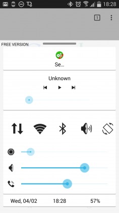
What if, for some reason, you actually loved the iOS control center drawer? You’re in luck because Android has you covered again! And yes, with an app. We’ve covered the Quick Control Panel before and, again unfortunately, it hasn’t really changed since then. You still get the same quick toggles and multimedia controls as before. Unfortunately, it hasn’t heard of Android 5.0 Lollipop yet, so it crashes when you try to use it there. It might also conflict with Android’s default Google Now invocation gesture (swiping from the bottom of the screen).

Wrap-up
Aside from an exercise in stretching Android beyond its original design, this rather lengthy exercise also demonstrates how flexible the platform is. And we haven’t even seen how OEMs modify Android to such a degree that it almost resembles little from the vanilla setup. Even if iOS should have a few fringe benefits, Android can pretty much catch up, one way or another, add those missing features. Thanks to the power and openness of the platform as well as the ingenuity of the developer community.


How you can find a way to mimic the iOS feature of double tapping the home button and dropping the screen halfway so things at the top can be reached with one hand.
That drop down feature is just a workaround due to the inadequacies of iOS.
On Android you can place app icons anywhere you please, right near the bottom where your fingers can reach. Android also has a back button right at the bottom as well. Combined with 3rd party apps with swipe gestures and the like, there really isn’t all that compelling a reason even to copy that feature.
Have you checked the Play Store? it wouldn’t surprise me if there isn’t an app for that already.
I disagree. In the top right corner of my screen right now (using chrome browser on lollipop) there is a threedot button that drops down a context menu. The only way for me to touch that is to either move the phone around in my hand or use my other hand. With this feature I could double tap and drop the top of my screen down so I could reach that button using one hand. It’s not just about going back.
Your right with larger phones there is a need for a “reachability” type mode, especially for things like the menu and search box. I don’t think Apples implementation is very elegant. I just did a little research and Samsung phones have had a reachability feature for a while now and its a much better implementation. Using a swiping gesture the entire screen shrinks to the bottom corner and stays that way till you swipe it back. With Apple it shifts from top to bottom cutting off the bottom and it only lets you perform 1 button press or action and then automatically switches back, thats pretty janky.
Samsung and LG both have a one handed mode. LG’s implementation is very clunky. I don’t use Samsung so I wouldn’t know about theirs. But I have used the iPhone 6 some and the solution is really quick and simple. Something like this would be nice as part of the stock Android experience.
please help me how to update my mobile android version please
Go to settings -» about phone -» system updates or check for updates then if there is a update available for your phone u can update it from there and then done
how to update my mobile android please me
You can take the time to double tap the screen to exercise your finger for a few milliseconds.
Have you tried one hand operation? You swipe one side to another and the screen will resize for one hand and giving you easy access without having to use both hands or moving your phone.
2 finger pull down brings me right to my quick toggles on Android 5.0.1 on my nexus 6. Sounds like the writer of this article needs to go buy an iPhone if those are the features he wants and prefers.
how to get my android apps more reviews?
If You are Looking For Extra Cash from 50-300 Bucks on daily basis for Doing Basic work over internet on your Computer From home for several hours each day then check this out
Still hard to reproduce the smoothness of iOS with Java holding you back.