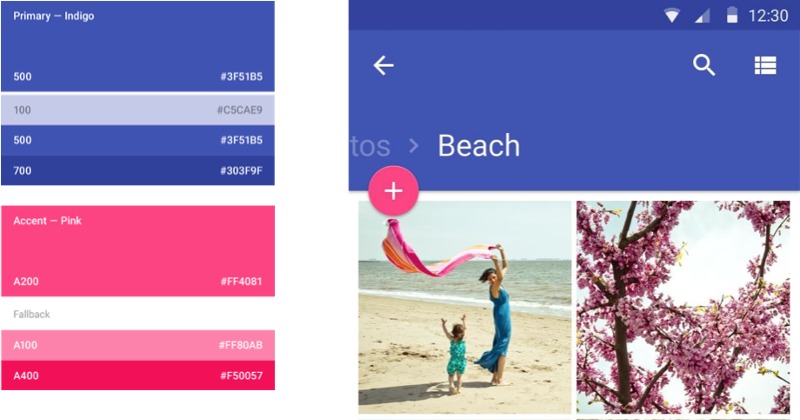
Android 5.0 Lollipop is coming and developers better be ready. Actually, many have already updated their apps, even in their current pre-Lollipop incarnations, to that new Material Design look. But to make sure that developers have dotted their i’s and crossed their t’s, Google has given out a checklist for developers and designers to skim over, in case they don’t have the time to pour through the actual design guidelines and previously released documents.
Material Design is all about paper, it seems. The user interface is largely driven by that metapher. Screens and interfaces are sheets of paper, and like sheets of paper, they are stacked or lie side by side, which each part moving in conjunction or in unison with other parts on the same layer. And like physical paper, surfaces cast shadows, hinting at their importance or, at the very least, their placement in the heirarchy.
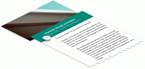
Although a completely digital design language, Material Design gives a nod to classical print design. Translated to mobile devices, this means the bold use of colors and large images. Apps should have a primary color and an accent color, the latter contrasting with the primary one and used to call users’ attention to important UI elements. But unlike print, Material Design can afford the use of animations to give meaning as well as to delight.
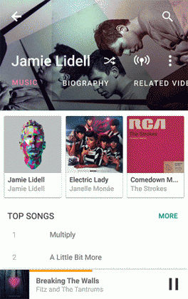
But Material Design is more than just an Android design, and by that we mean it isn’t confined to smartphones and tablets. Material Design, in theory, is set to encompass Google’s products, from Android Wear to Android TV and even to the web. Whether that will be true a few months from now remains to be seen, as more devices in the latter category get added to Google’s family. For the meantime, however, do expect an influx of apps that will go with what’s en vogue, presuming and hoping that developers have read this post and many others like it.
SOURCE: Google






can’t wait to dive right in