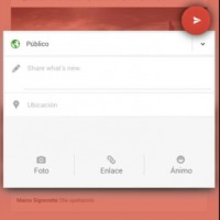
A redesign for the Google+ Android app has been discovered, showing a wholly new layout and different ways to access functions. The new UI looks eerily similar to others we’ve seen from Google recently, and the user who found it has been shunned by Google as a result. Once again, Google+ users may be forced to re-learn how to use the social service.
The redesign has a bright red bar across the top, which hints at the overriding color scheme this time around. Composing a post is done via the floating red dot toward the botom of the screen, which opens up a new post window. The rest of the screen dulls to a pinkish hue that is just plain unattractive.
The similar washed-out red can be found when you slide the menu from the left side of the screen, though the menu doesn’t seem to have changed much. The bright red bar across the top supports flat, white icons that match the floating compose button.
This is said to be an “early test build”, with no timeframe for release offered or known. Though certain design aesthetics are similar to other Google redesigns we’ve seen lately, the color scheme is terrible. It makes the app look like a dated Facebook rather than a sleek social layer to Google.
Via: 9to5 Google


