With the announcement of the Android Wear platform for smart wearables, Google is also rolling out Developer guidelines for the new project. In checking out those reference notes, Google’s aim becomes a bit more clear. By virtue, we can start examining what our experience with the devices will be like.
With this article, we’re taking a look at notifications. Though Google is only officially accepting two face formats — square and round — the notifications should act the same with both interfaces. The key takeaway from Google is that the Android Wear device is meant for glancing at quick info, not staring at all day long. Google is encouraging Developers to eliminate the needless info, and pare down our experience for the small screen:
Omit needless text from your notifications. Design for glanceability, not reading. Use words and phrases, not sentences. Show, don’t tell: where possible use simple icons, glyphs, and visualizations to convey your message.
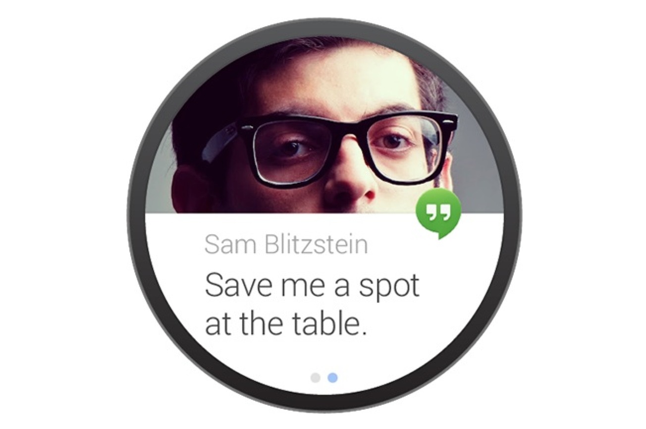
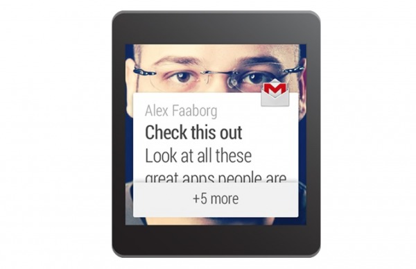
We’ll also get info in a card format, similar to Google Now. If information cannot be fit onto a single card (which means ‘single screen’ for a smartwatch), it will be split amongst two or more cards. We’ll get the ability to navigate multiple cards with swipe, with multiple cards noted to us in the form of blue dots at the bottom of the screen. Developers can also utilize a stack function, which you can see below, to notify us. Notifications are also shared between your smartwatch and other devices, just as if you had a tablet and phone.
Urgency is also paramount to Android Wear, as Google notes to Developers what should and shouldn’t be marked as important. In discussing the priority of a notification, Google asks that Developers only use the vibration “in cases that need the user’s urgent attention or action (e.g. a time-based reminder, a message from a friend).” For those that aren’t important, like “a transit times card, daily pedometer count, social network updates”, Google is asking that they be slipped quietly into our card stream.
It seems as thoughthe Android Wear device — whoever makes it — will be very Google Now-ish, which is just fine by us. It also sounds like vibration is a key component for hardware, so expect to see that on just about any device utilizing Android Wear. We can expect that an Android Wear device will push notifications to us (again, like Google Now does, just a bit more aggresively in this case), but utilize our smartphones for more robust features. Think of it like Google Now as it stands on your smartphone; you get a card telling you about travel time to a place, but it redirects to the Google Maps app when you want turn-by-turn directions. It should be just about the same with Android Wear.


