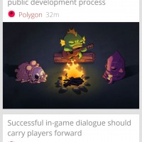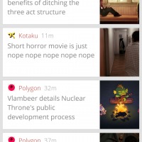
Flyne, the offline reader app from the creator of the popular Falcon Pro, has just announced its latest update. Along with speed improvements and bug fixes, this new version gives users a few new options on how they want their articles to be displayed.
Granted, the updated isn’t exactly a visual overhaul but there are subtle changes both in the way things look and work that should hopefully improve the user experience. First, users now have an option to use a more space-friendly compact presentation, listing only article titles and image thumbnails without any content preview. The day and night themes have also been tweaked to give a more polished appearance. There is also a new layout just for tablets.
Beyond appearances, however, Flyne also offers a few behavioral changes. Users can now simply double tap an article to close it and return to the list view. Images inside articles can also be zoomed and easily downloaded. What’s more Flyne automatically marks articles as read when you scroll past them. Unfortunately, there seems to be no way to turn this behavior off should you wish to. It does get two-way Feedly sync this release, making the integration with the popular news reader even tighter.
Unfortunately, Flyne is still a sort of trialware. While the app is free, you will only have access to Flyne’s own predefined list of sources under Popular Feeds. If you want to integrate with Twitter or Feedly, which is part of the appeal of the app, you will still have to make an in-app purchase for each of those features.
SOURCE: Flyne


