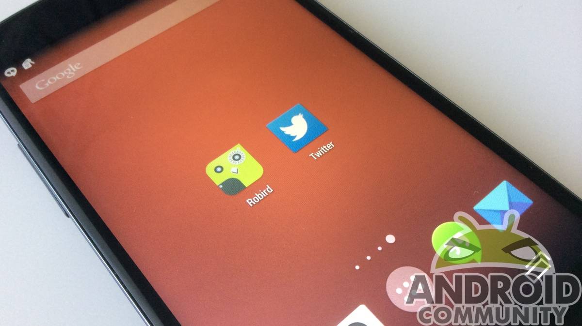
Twitter apps are prevalent on the Play Store. It’s hard to make a Twitter app stand out, considering the nature of Twitter is so simple and straightforward. Robird is a new Twitter client for Android that brings a neat new look and subtle variation to what we’ve seen before, but is it different enough to make you want to switch?
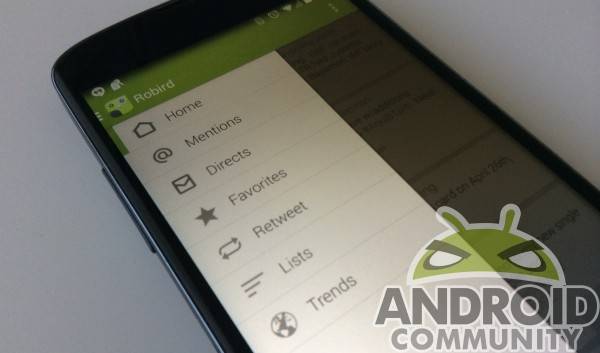
Robird has a few different themes to choose from, which should make those picky about UI happy. We like the overall UI, too; it’s clean and clutter free, and keeps to newer Android styling guidelines. The settings menu sits on the top right while a slide-out menu from the left houses everything else Twitter has for you.
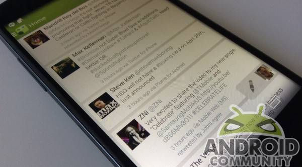
As for what it brings to the table, Robird isn’t fussy. It’s a simple scrolling Twitter client, but we like some of the app’s functionality. There is a little pencil floating on the bottom right, so no matter where you are in Robird you can create a tweet. The tweet editor is simple and straightforward, and the icons for adding a pic, mentioning a user, or other actions are a touch bigger and easier to see that with the stock app.
The new tweet notification is nice, giving a number of how many you’ve missed rather than a simple notification. Tapping it takes you straight to the top, making discovery of new stuff pretty quick. A “trends” option in the menu is also a neat way to discover what’s going on via Twitter, providing popular hashtags.
There are some subtle issues with this one, though. Depending on how you use Twitter via mobile, it may not be for you. We like the interface, but favoriting a tweet is a bit cumbersome: long press the tweet from the home screen, then hit the top-left menu to favorite. We prefer the simple “star on the tweet” of the stock app for favoriting. You can also select the tweet (which opens it up in a fresh page) to favorite, but it’s too many steps just to note you laughed at a silly joke.
If you’re a processor of info who uses Twitter to get a boatload of knowledge, Robird is a good app to check out. If you like composing tweets, you should also give Robird a chance. It’s got a great interface, and tweets are easy to read. The settings menu also has a ton of neat tweaks you can make to suit your needs, so the app is nimble enough to make a lot of people happy.
If you like to interact quickly with a lot of people, Robird probably isn’t for you. Replying takes a long press or viewing the tweet on a new page, as does retweeting. In those instances, it’s cumbersome. Like most Twitter clients, it depends on how you use the microblogging site, so take that into consideration should you want to give it a shot.
If you have a favorite Twitter client, let us know in the comments section below. If you’ve given Robird a shot, feel free to chime in with your opinions of it, too. Robird is definitely not the only Twitter client around, but we think it will work well for most users out there.


the tweeter characteristics had gone, its most memorising blue !
btw, updating new tweet is the most important thing, as i used plumb before, its update is damn slow and time-taking…
I really like the app, but keep going back to Tweetings. The “favoriting” is a bit of a pain, as well as the ability to mute users. You have to type each one manually. Also, my favorites were not updating when i unfavorited them. They were still showing up in my list.
Does anyone know if Robird’s push notifications are “true” push, or just background polling like other apps do? Need to know if it’s API based for an article I’m writing.