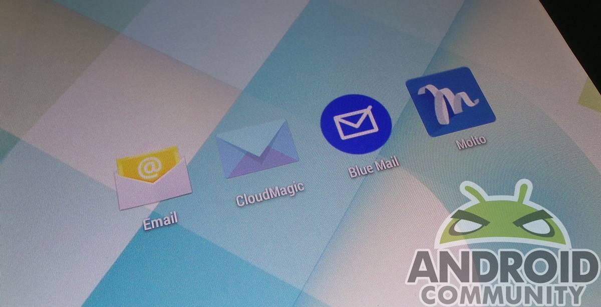
For some, the stock Gmail/Email apps included on their Android phone just don’t work well. Both are serviceable, but there are times we want a new look, or added functionality. Are there any email apps that are actually better than the included Android apps? We take a few for a spin to find out, focussing on those that can handle multiple mailboxes.
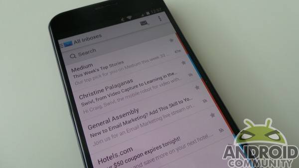
Cloud Magic
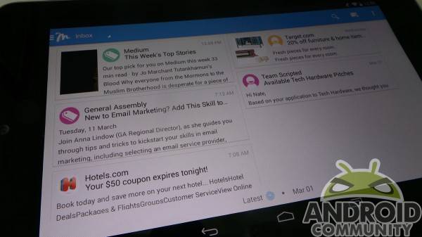
This email app is one of the more serviceable we found. It has a clean interface, and the various inboxes are color coded, so you know which service it came through. On opening an email, attached files look like Drive files on mobile, just big square thumbnails. That compliments the slide-out menu we find with other modern Android apps, making Cloud Magic one of the cleanest looking email apps we’ve found.
The app did a good job of handling multiple email boxes, and the color assignment to each account was handy. It did a good job of syncing, and kept up admirably to changes and communication via email from multiple devices. If you’re picky about design, their bright blue notification bar icon might be polarizing, depending on where you end up in the Android UI design argument. Overall, we liked Cloud Magic — clean, simple, and really easy to set up and use.
Blue Mail
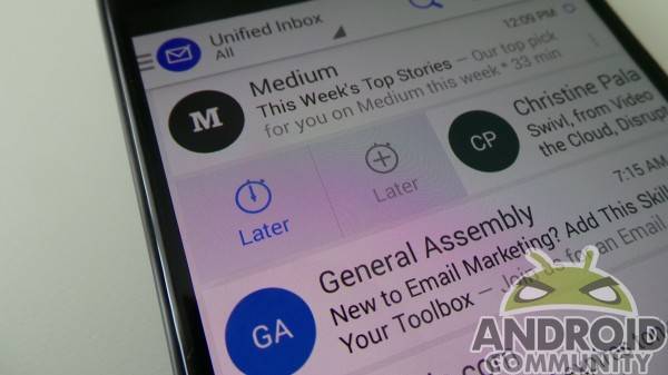
Where Cloud Magic feels a bit industrial in design, Blue Mail feels a bit more comical. Rather that color code your inboxes, Blue Mail uses icons — like Gmail. You’ll either see the logo of the sending party (LinkedIn emails, for instance, have the square “in” logo) inside a colored circle, or the picture a person has assigned their inbox.
It’s got the slide-out menu as well, but there’s one really neat trick Blue Mail has if you like to procrastinate. Sliding an email to the left side of the home screen brings up the option to delete, while sliding the email to the right brings up two options for “later”. One puts it off a set amount of time (which can be changed in settings), while the other has pre-determined options for putting it off until the evening, next, day, next week, or whenever you want. Once you schedule an email for a later time, it will pop back up and remind you. It’s a great trick for those times you’re busy and just need a reminder later on.
You can view those delayed emails on the bottom menu that pops up, which we’re not crazy about. We’d prefer they’d have put everything into the slide-out menu or settings menu. The pop-up bottom bar makes the app feel a bit cluttered, really. We like Blue Mail, but if you have a busy inbox, the tight interface may drive you nuts.
MailWise (beta)
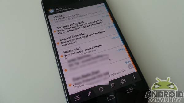
MailWise might just be the illegitimate child of the above mail apps. It’s got a less business-like interface like Blue Mail, but color codes inboxes like Cloud Magic. It’s a really straightforward email app otherwise, but has a few issues we aren’t crazy about.
The interface feels dated, and the bottom menu bar reminds us of long-forgotten Android styling cues. There isn’t much to it, really, and we feel like the beta tag really means “forgotten about by Developer”. It’s a serviceable app, and does its job, but there’s not much that is special about this one. Another strike against it is a lack of tablet utility — we couldn’t load it onto a Nexus 7.
Molto
Molto takes a different approach to email. Instead of giving you a list of messages, Molto brings them to you in card format. You’ll see a card with a snippet of the email, and the same kind of round icons we found from Blue Mail. Swiping to the left or right deletes an email, and it’s current with Android styling.
Strangely, it forces you into landscape mode when used on a tablet. That’s likely because on a tablet, Molto provides a different experience altogether. You can scroll the message inside of the card, which is a nice trick for accessing info quickly. We’re not crazy about landscape typing, though. We should mention we’re using this on a Nexus 7, and it feels like Molto for the tablet was designed with larger 10-inch screens in mind. If you have one of those, you likely won’t mind the landscape compromise.
On the smaller smartphone screen, Molto was less exciting. The card format didn’t work well for a busy inbox, as messages were easily missed. The app also does a terrible job of syncing with the server, routinely showing dozens (sometimes hundreds) more messages than we had. As an alternative to Gmail, wherein you’ll use Molto exclusively, we could recommend it. For the use-case scenario we’re after, it just falls short. We like the layout for bigger screens, but the rest falls flat.
Conclusion
Do any of these apps do anything groundbreaking? Not necessarily, but some are just different enough to make you want to give them a shot. We like Blue Mail for it’s easy way to put emails off for another time. Check an email out, then slide it out of the way while you mull it over. It will prompt you to respond when you decide it’s appropriate to. Pretty neat.
Molto has a slick new interface, but the tablet version is hit and miss. We like the in-card navigation, but landscape is not a favorite for smaller devices. It also had issues with sync, and didn’t seem to accept that we were using email on the desktop, or other devices without Molto. If you like the interface and can use it as your sole email, it might suit you well. For us — and we’d wager most of you — that just doesn’t work.
If you want to get away from the stock Gmail or Email on your Android device, Cloud Magic was the best all-around performer. It synced beautifully, and the no-nonsense UI was nice for our busier email inboxes. Setup was easy, too. Cloud Magic performs where it needs to, and that’s all that matters.
We aren’t saying stock Gmail and/or Email are lacking, but some don’t find them easy to look at, or useful. We’ve given some alternatives, but if you have a suggestion, please let us know in the comments section below. We welcome suggestions on which email you use, and what you like about it!




Currently use Cloud Magic for my business mail. It’s a beauty. I was unable to get an Exchange account work for a client with the stock android email app and Cloud Magic performed flawlessly. I should mention there is another really great app for mail : K9 Mail
If you value your privacy then I’d stay away from Cloud Magic, especially when it comes to business accounts. Once you sign in with an email using their app they then upload your emails to their own servers…hence, one of the reasons why their search is “lightning fast”.
So true! The word “cloud” speaks volumes & pretty much says it all as there has been so much talk/articles about the high risks of privacy regardless to what they say about their privacy. Such contradictories between the large print that they want you to see & the small print in the terms & conditions that they know nobody reads but accepts.
BUT I’ve just read somewhere that all of these email mobile apps, stores/uploads them to their servers. The word “cloud” just makes it a bit more obvious but the rest of them do it too. Please correct me if I’m wrong, I’m basing this on 1 article & I normally base my consensus of fact, on the internet, after research of several articles from so called “trusted sites”.
Cloud Magic DOES NOT support colour coding accounts at the mkment
I use CloudMagic but also I’ve used SoilMail
It’s surprising what a lack of quality 3rd party email applications there are when customization is one of the best parts of the Android platform. Why is that? Can’t be because everyone is so happy with the their stock or gmail app. Difficult to develop….technical limitations?
There really isn’t much of a demand for them. K-9 Mail has had a strong following for a few years now. Other than that people usually stick to Gmail or whatever other email app comes preloaded with the device.
Nice roundup. We’ve come a long way from the days when K9 was the only decent 3rd party client.
SolMail should definitely be on here.
Sure the stock Android email clients are lacking.
In the first place, why are there two separate email clients? Most people have several email accounts, normally not all of them GMail, so why is Google pushing separate clients?
The GMail client is definitely better and more polished than the regular stock Email, so I guess it must have something to do with the ability to parse information easier from GMail, so that Google can learn more about us to use for ad targeting. That and attempting to make it so inconvenient to use non-GMail accounts, that you’ll end up moving to GMail only.
The stock regular Email client has a number of issues, including sending large attachments, and being hit or miss with multiple accounts.
I personally use K-9, which has come a long way and IMO is still better than the email clients listed above.
Surely it’s got more to do with the fact that google own gmail and so can bake in whatever specialised features and APIs they want to make the email experience as good as possible in the gmail app. Whereas with other email providers, they can only use the generic facilities provided by all email servers so you get and basic service and not much more. It’s the same reason yahoo’s android app is far better than yahoo email accessed via the generic email client.
I have been using all of these email clients and Blue Mail is the best and most pretty by far. It’s much better than Gmail itself, and it is frequently updated. Recently they have added quiet times which let’s you pick when are your active hours. Neat!
my Aunty Arianna got a nearly new silver
Chevrolet Colorado Crew Cab by working part time off of a macbook air. try this
Jump999.ℂom
What about Boomerang?
The word you want in the first “Cloud” paragraph is complEment, not compliment ^_^
Oh that makes it so much better “le” not “li”, now I understand. Moisture management is very impotent.
Please take a look at “Seed” email client. The UI is not bad! 😀
Do you have a play store link…. Couldn’t find an app when I looked…. Thanks
this? https://play.google.com/store/apps/details?id=com.mangrove.seedmail
I use the default email client from Android KitKat (you can side load it)
Thanks