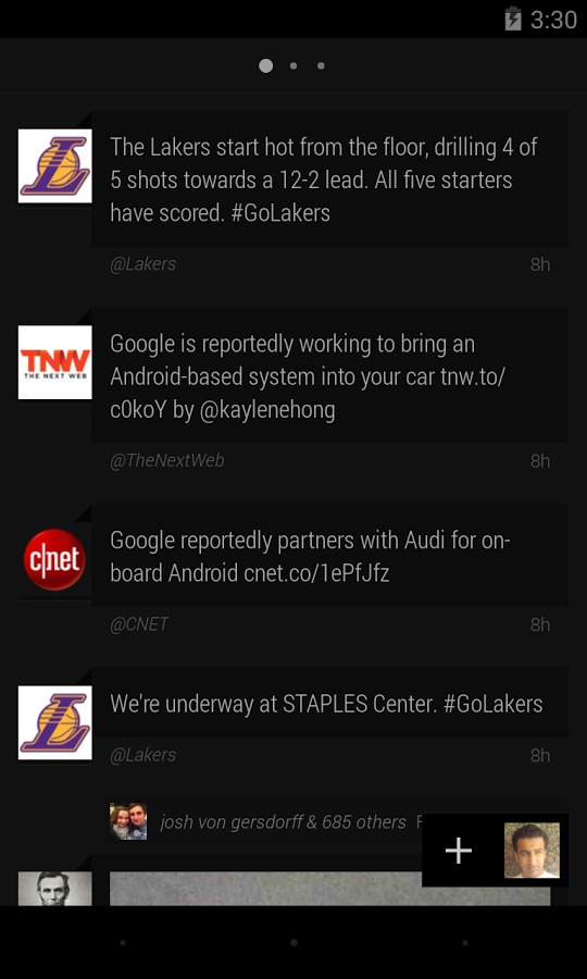
After nearly a year since it landed on the shores of Google Play Store, Carbon has released version 2.0 of the popular Twitter client. With a new visual theme and an even deeper focus on its minimalist design, Carbon is ready to get back on track as one of the top contenders in the Twitter space.
Twitter has a rather complicated relationship with third-party apps, with dozens trying to compete for the top rank. Twitter, at times, tries to steer things its way to favor its own client, which, until recently, has not been favored by hardcore Twitter users. Carbon is one such competitor and its call to fame is its rather simplistic philosophy on what a Twitter client should be.
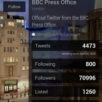
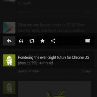
In this major version, Carbon doesn’t stray from its path, but it does show off a new look. It has clung to its name and now sports a more carbon-centric style, even changing its iconic hawk icon into a more abstract and faceted logo. The UI, or Interface as the developers prefer to call it, still has the markings of minimalism, with the app revolving around three main timelines, with an optional fourth for dumping anything into. Carbon v2 has also shifted a few elements around, leaving the user’s eyes to focus on the tweet itself and the avatar, employing judicious use of typography and whitespace for a cleaner look. Interestingly, to accommodate such minimalism in the main interface, Carbon has opted to dump everything else into a “Chaos Menu”, including settings, profiles, retweets, favorites, and even other Twitter accounts.
Aside from these visual changes, Carbon v2 also sneaks in some new under the hood features, like Do Not Disturb mode, support for Vine playback, and a redesigned homescreen widget. Carbon for Twitter v2 is now up on Google Play Store and is free for anyone to download and try out.
Download: Carbon for Twitter on Google Play Store
SOURCE: +Carbon for Android


I have to say, I’ve tried Carbon, but can’t seem to enjoy the flow of it overall. Just something about it that rubs me the wrong way. I can definitely see why people like it, but not for me.
Personally I have been quite happy with Robird for the last half year or so.