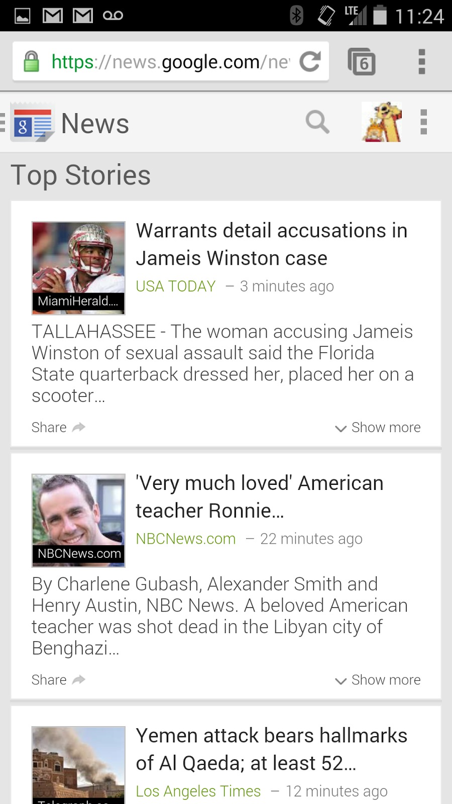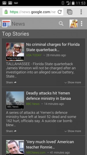
Google is really putting its card-based aesthetic everywhere it can. That design style is now making its way to its browser-based Google News web app, making the service not just usable on mobile device but good-looking as well.
This card design, which could be traced back to Google Now’s arrival, focuses on cleanliness and brevity, offering users a simple interface and presenting just the right amount of information density, with an option to see more at a tap of a finger or click of a mouse. Such a design might be particularly useful in a news site, especially when browsing from a mobile device such as a smartphone. Now users will get to enjoy a better browsing and reading experience on Google News thanks to changes that Google has started to roll out.
But aside from that functionality, Google’s update also brings in some new features. Users will be free to choose between a light and dark theme and can customize the fonts used. They can even choose larger cards to accommodate more information at a glance. Navigation has also been simplified, with a dedicated News icon at the top-left which will reveal a list of both pre-made and custom-made sections. Unsurprisingly, Google has found a way to also include some form of Google+ integration via related social posts.

The changes to the Google News web app will start to roll out to users in the US first, with an international launch promised to come soon. No download or user intervention is required. One just needs to visit the Google News website from Chrome on Android to get access to the new look and features.
SOURCE: Google


Hope this changes roll out the soonest, so that it would be pretty easy to access websites.