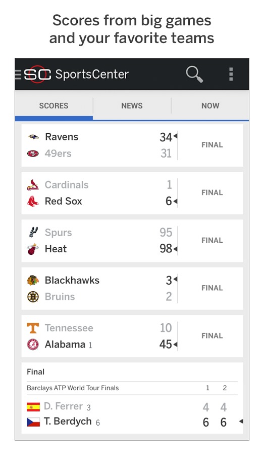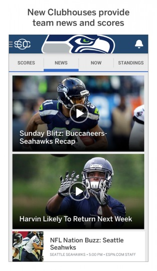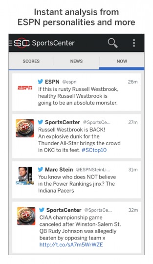
ESPN has just pushed out an update that changes its popular ScoreCenter mobile app both without and within. Now known as SportsCenter, the app will not just give users insights into team and game scores but will now also deliver news, videos, and a pinch of social networking.
ESPN’s ScoreCenter app isn’t one that’s in dire need of changing. Based on recent statistics, the app has been downloaded 43 million times, implying the popularity of the app. But the Disney-owned sports brand also recorded an astounding 3.2 billion minutes of user time spent on it mobile sites and apps. It is no surprise, then, to see the company wanting a bigger piece of the mobile pie, and ScoreCenter, or rather SportsCenter, just happens to be its next biggest ticket.

ESPN SportsCenter now offers sports fan much more content, and probably much more than they may want or care about in a mobile app. For one, there are videos from ESPN’s cable service, stories, and news. Fortunately, users can filter out only the sports or topics they care about and remain blind to the rest. Naturally, social networking is also present, though at the moment users will only be bombared by Twitter posts from ESPN. Others may soon follow.

SportsCenter fortunately still does what it used to do best: tell scores. Based on comments and tests, it seems that the new features didn’t bog down the app too much to make that once primary use case less enjoyable. It remains to be seen, however, if the addition of these much features will attract more users or turn off its fans instead.
Download: ESPN SportsCenter on Google Play Store
VIA: AllThingsD


i stopped using the old app years ago when it was slow and lacked intuitive controls, it was a copy and paste from the iphone app. but now it’s a lot better, but the ads they allow are animated and that tends to slow things down initially when you start the app. if they used more static ads it would operate a lot smoother and would be more enjoyable to use. and they could cut the amount of ads down, it’s like every other block of information and it’s the same ads over and over. It needs a little more fine tuning. But they are off to a good start on the redesign.
GoHawks