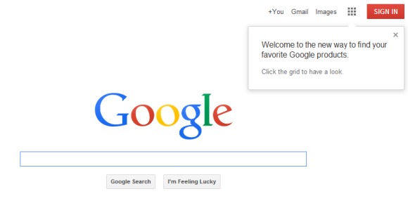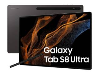
The words “Google” and “design” are not usually two words you utter in the same breath without some sort of negation in between. But for the the past years Google has, slowly but surely, made strides in reinventing itself and its products, bringing it much closer to that aesthetic domain that has previously solely been Apple’s purview.
April 4, 2011. That seems to be what Google’s designers regard as the date that ushered in the company’s design revolution. It was the day that Larry Page took over the reigns as Google’s CEO. Before then, Google was both famous for its extreme minimalistic and functional aesthetic and, at the same time, notorious for lacking any sense of unity and harmony. But as times, technology, and users change, so did Google need to adapt to become not just relevant, but also desirable.
Google underwent a face lift that was gradual yet noticeable. Android needed to be more than powerful, which no one disputes, but also less daunting and more beautiful. Google services had to transition from being disparate entities, each sporting its own team’s design sensibility, to a unified look and behavior under Page’s “One Beautiful Google” mandate. The results are the redesigned Android, Google Now, Google Maps, Chromebook Pixel, the new Nexus 7, Google Glass, Chromecast, and more. Products that do not eschew design as an excuse for being powerful.

Design at Google is still not perfect, but the journey is far from over. In just a few years Google has come a long way, but it still has a bit of traveling to do. But if this trend is any indication, Google will soon be a company that provides not only the technology and power that we’ve grown to depend on, but will also exude a sense of beauty and finish that we will grow to love and desire.
VIA: Fast Company


All Google did was rip off Microsoft and Windows Phone.
Yes Google copied Bing & Apple maps.