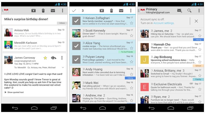
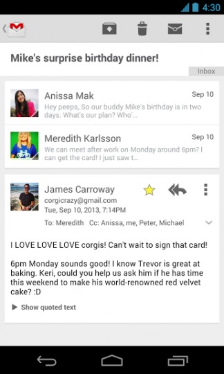
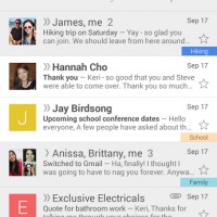
Google has just confirmed this afternoon that they’ll be issuing an update to Gmail starting today which should seriously improve the user interface. Cards everywhere seems to be their new design direction, as we’re getting the same Card-based UI that was first introduced with Google Now, and eventually arrived for other Google apps.
We have a feeling Android 4.4 KitKat will introduce a lot more Card UI elements, but for now it’s Gmail’s turn to enjoy it. Starting later today (gradual rollout) users will start getting an update to a slightly new and refined Gmail on Android. The card UI is cleaner, simple, and something we’ve loved since we first saw it with Google Now.
The card UI will mainly be in the conversation view, as to not split up your inbox too much, but once in a conversation you’ll see the pretty and easy to navigate new UI changes. We’re all for it too, so thanks Google! The conversation improvements are the biggest part here, as that’s always been one of my least favorite aspects of the recent Gmail app.
That isn’t all either. Google ends their announcement and Google+ post by confirming the app will now automatically let the user know if automatic email sync is enabled – or disabled – right in your inbox. So now you’ll never miss an important email because you forgot to enable sync.
Update: And thanks to @WinDroidGuy here’s the download.
VIA: Play Store




LONG overdue for REAL enhancements … How about finally giving Android gmail users the ability to use underline, italics, boldface, others … This is Gmail, not A TEXT editor!