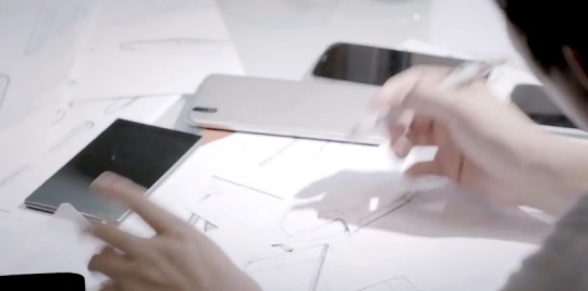
LG decided to take a rather different approach to the standard smartphone design with their new G2. Heading away from the usual look everyone is familiar with and throwing the buttons all on the back. It’s daring and bold, and certainly not for everyone. However, we found it quite nice in our LG G2 Review. Today the company is giving us a detailed video and look at what went into designing the phone.
If no one ever tried anything different we’d still have four dedicated Android buttons, probably hardware, and that useless search button would remain. We wouldn’t have the extremely popular Galaxy Note series either. So that’s why we’re all for LG trying something new. Just like AndroidCentral mentioned, for better or for worse, at least they tried something new.
Late last week LG revealed a nearly 5 minute video showing us the entire story behind the design. How they decided on the buttons after a year of prototypes. Ones that didn’t make the cut, and in the end what ended up being what we have and love today. It isn’t extremely amazing, but it’s a neat video worth checking out. Even if it isn’t in English.
While we weren’t fans of the smaller buttons on the back of the Verizon G2, overall we love the approach, and after a few days you’ll barely remember the buttons being on the side. Obviously the design isn’t for everyone, but you have to admit it’s a sexy looking phone. Those bezels!

We even saw a glimpse of some crazy 6-inch or bigger phones, and some tablets in the video. We know the LG G Pad 8.3 is coming soon, but maybe that isn’t all. We’ll have to wait and see. Who likes their new smartphones design?


It’s actually pretty good. Slim bezzels have been quite a dream so far. If the UI was more subtile. Or elegant. Or simply flatter. It could have been a great phone. Such a pitty that there isn’t a Google Play version of it.