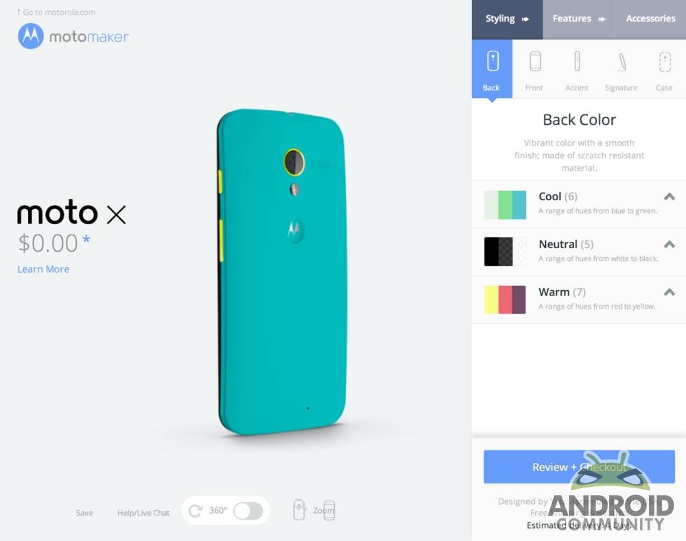
This week we’ve had the opportunity to create our own customized Motorola Moto X with the company’s first edition – pre-release edition, that is – of Moto Maker. This is Motorola’s customization engine for what may very well be a variety of devices in the future, but for now is centered on Moto X, a device which you can also see in full effect in our Moto X review. This process is simple – colors, letters, and specifications are but a click away, and the UI to back it all up is as simple as it is smooth.
As we saw back at the launch of Moto X, the user – us, in this case – gets to choose first a Back Color for Moto X. There’s three categories: Cool, Neutral, and Warm, with 6, 5, and 7 choices in each category respectively. At the moment this is the limit – we’ll be seeing bits like Parking Cone Orange and textured Wood Grain by the end of the year. The same goes for the front color choices – there’s just black or white for now (though we’ve not heard word of additional choices incoming).
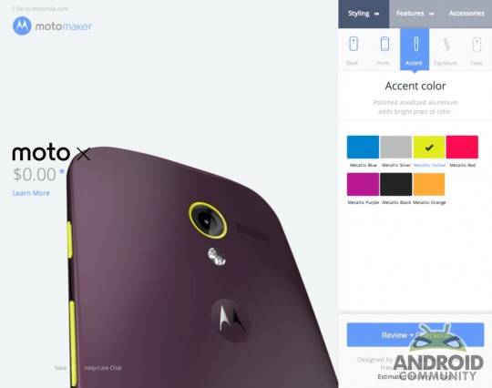
There’s also an accent color which sits most prominently around the ring of the back-facing camera. It’s here that you’ll be able to bring a splash of life to your otherwise conservative gray back color choice. Or you can choose to clash like mad with a green on top of a purple – whatever you do so decide.
A signature are is also active at the moment – with one whole heck of a lot of choices for engraving the back end of the device. Limits appear to include words like “Apple” and “Android”, yet “Nexus” works just fine. At the moment it would seem that brand names are limited, but then again, some work, some don’t. In all you’ve got 20 characters to run with.
The same is true of the optional boot screen greeting – you can customize the start screen in the software build set for your unique Moto X, but don’t try to put a brand or a swear word in there: you’ll be called out on it. You’ll be able to add your own wallpaper and have yourself signed in to Google+ and the rest of your Google services right out of the box with this interface as well.
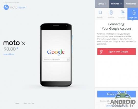
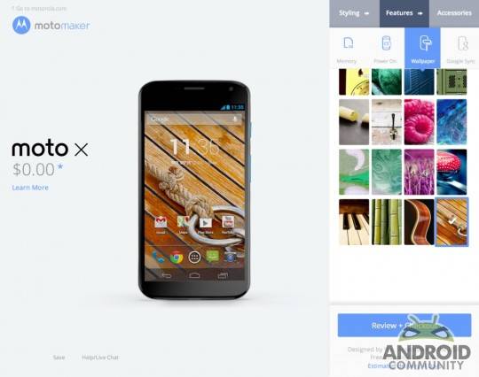
Essentially you’ll be getting a device that’s ready to jump right out of the mailbox into your pocket. This includes jumping with a pair of earbuds and a case, if those are the sort of accessories you’re all about too. SOL earbuds and Incase are Motorola’s chosen partners on this adventure.
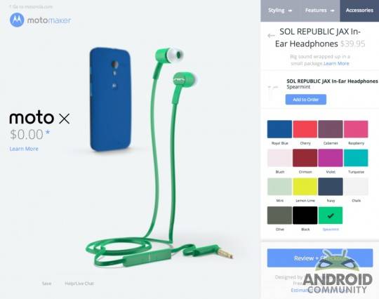
The ability to choose what size of internal storage you’d like to pack inside the Moto X is here too, be it 16 or 32GB, while at the moment we’re limited to 16GB for this test run. The whole time we’re selecting colors and accents here and there, we’re also able to see the device from all angles – quite a nice simple touch added with HTML on one end and Flash on the other – it’s all quite seamless.
This service will be launching with the AT&T version of the smartphone, but chances are you’ll have your shot with any carrier in the near future. Stick around as we get this device in the mail to see how our creation turned out up close and personal!






Chris You also getting a Verizon wireless Moto x ?
Our review was the Verizon edition. Why do you ask?
In the first part of the video the Moto X is shown with a Verizon wireless 4G lte logo, so I figured you were ordering a Verizon phone. 🙂
Verizon will get MotoMaker in a month or two. November is the latest, from what I’ve seen.
Until then it’s a black or white Moto X for Verizon.
I want one.