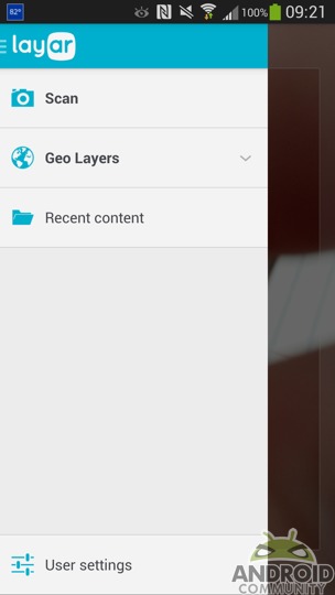
The Layar app has been around for sometime now, however that same app has recently gotten a new look. In fact, the folks at Layar have announced a new look all around. Layar users will likely notice a new look and feel for the Android app as well as on the Layar website and even with the company logo. And aside from the new look and feel, there were also some improvements and changes within the app itself.
To begin with, the folks at Layar have said this newly updated mobile app “marks the beginning of a new era for Layar as we [they] continue to help bridge the gap between print and digital.” Which that bit alone should give a bit of of idea about what Layar is useful for, just in case you have yet to use the app. Basically, think augmented reality, or being able to scan real-world items to get more information digitally.
Coming along with the new look for the mobile app is the addition of a “Recent Content” section. This simply means you now have an easy to access list of content that you view. It should also simplify things if you want or need to view something you previously scanned. This update also brings the ability to scan any QR code. The Geo layer section is also said to have been simplified a bit.
Of course, that Geo Layer, along with the Recent Content section are both available by way of the left-side navigation menu. You can access that by tapping the Layar logo in the upper left. Also tucked away in that menu is your user settings. That all being said, Layar now touts more than 1 million installs on a monthly basis and if you have yet to fall into that already installed category — the app can be found by way of the Google Play Store.
SOURCE: Layer


