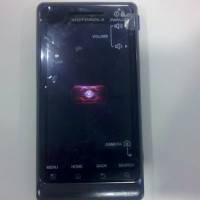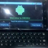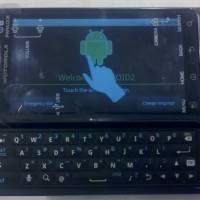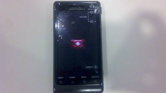
The Motorola Droid 2 is one of the most widely leaked devices in recent history, but that’s not a bad thing. It built up plenty of anticipation for the device. Which can only go to help the sales of the true successor to the original Droid, which launched late last year, especially considering Verizon is taking a far quieter approach with the release of this device. Pre-orders kicked off today, and it will officially go on sale tomorrow at Verizon locations all over the country. But, we managed to get some hands-on time with the device yesterday, which turned into an impromptu photoshoot (which was taken with the Droid X).
Initially, especially after using the Droid X for awhile now, the Droid 2 feels small. That’s not surprising, though, considering compared to the 4.3-inch touchscreen display on the Droid X, the 3.7-inch version on the Droid 2 is a noticeable difference. That aside, though, the build quality is plain as day, just as it was on the original Droid. Though, without the obvious metal finish, that may be lost on some customers. It does feel solid in the hand, and the slider is just as good, if not better than the original’s.
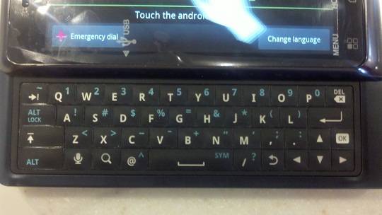
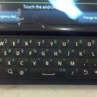
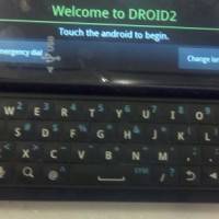
Sliding the device will show you the update physical keyboard. Compared to the original, this new one is leaps and bounds better. With raised keys, and a plastic/rubber feel to them, which means you won’t be sliding around all over the place, we found it immediately easier to type on. We will add that the keys themselves felt small for some reason, but again, that could just be that the phone as a whole feels smaller. We don’t think it would actually alter the typing experience, or hinder it in any way. As with any keyboard, using it over time will make you more adept with it.
Unfortunately we weren’t allowed to play around with the software, but considering we know it’s the same as the Droid X’s, we know what to expect, and probably don’t need to go into any depth on that anyway. As for the rest of the physical aspects, on the back of the device you’ll find the 5MP camera with the LED flash. Oddly, the back cover has a blue hue to it, while the front of the device has that obvious silver lining. We’re not fans of the color scheme, truth be told, and we would have much preferred the matte black coloring of the original. But, it’s not a deal breaker by any means.
Overall, with as quick of a hands-on as we had, we like the device. And, considering it’s running Android 2.2, and should work “better” (at least software wise) than the Droid X, we’re tempted to trade it in. Even if we are losing the HDMI output and larger screen, we’re wondering if it would be worth it in the end. Especially, if anything, for that updated physical keyboard. Check out the full gallery below.


