When you’re trying to stand out among a couple of dozen competitors, short of being the best, you need to offer something special. 9 Cards is a home launcher that tries to do that by incorporating almost every basic feature in other launchers. But does that equate to a great user experience? Let’s try to find out.
Unobtrusive
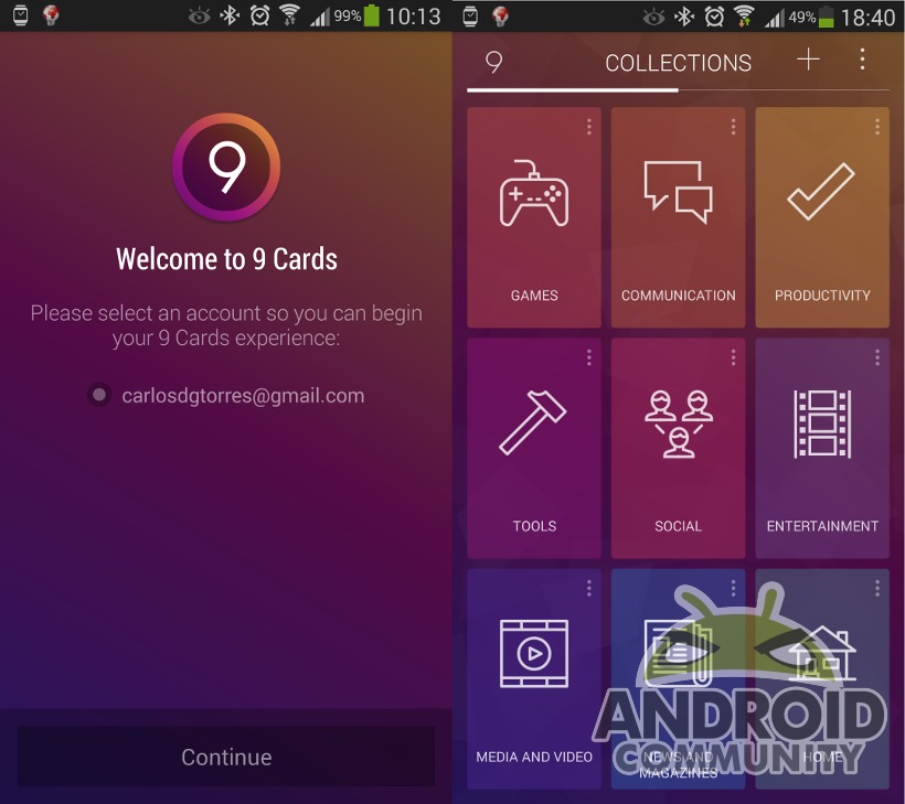
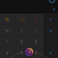
Despite it’s name, it’s somewhat difficult to call 9 Cards a “home launcher”, but it’s not your run of the mill Android app either. 0ne of its advertised features is that it is unobtrusive, a word that can be interpreted on so many ways. Here, it means that it doesn’t replace your actual home launcher but functions alongside it. At least for now. To put it simply, 9 Cards is an app launcher that you can invoke wherever you are, pretty much like Action Launcher or other side launchers. Except that it actually occupies the whole screen.
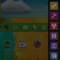
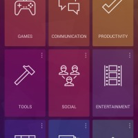
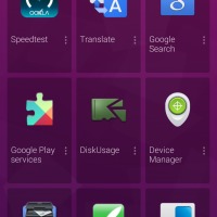
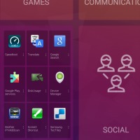
9 Cards can be called two ways, both of which can be toggled on or off. The first emulates the Google Launcher method of swiping up from the Home button or icon actually from almost anywhere in the bottom. This brings up the 3×3 grid of app collections you would normally see when launching 9 Cards. The second is called 9 Cards Everywhere. Drag your finger down from the top right corner of your screen and you will see a drawer of the first 9 collections on your list, letting you jump to the exact category you want instantly. The location and width of that trigger area is, of course, configurable.
Once inside, a few gestures need to be known. Swiping sideways takes you from one collection to another. When inside a collection, swiping down brings you to the overview page. Swiping down again has the effect of shoving 9 Cards to the background.
Smart
Most launchers today try to show they’ve got some brains and 9 Cards is definitely no different. The moment you log in to your Google account, it will inform you that it is trying to sort your apps into categories. And like many others of its kind, it sometimes fails.
But that’s not the only sort of intelligence it has. It also tries to study user habits and behaviors to better suggest apps or better group them together. It also has categories like Night or Work where it puts up what it thinks are your most used apps during those times. Like any other smart launcher, however, it takes time to build up its knowledge, definitely more than just a few hours.
Social
9 Cards also tries to add a bit of that oh so necessary social networking element. Sharing works on two levels. Probably the most obvious one is the sharing of themes. Yes, 9 Cards has themes but of the limited kind. Perhaps more interesting, however, is the fact that you can also share your collections. That is, you can show other 9 Cards users what your favorite games are or what your most used productivty apps are. Furthermore, those monitoring your shared collections will be informed should you decide to update your own list.
A Perfect Number
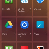
All throughout our tour of 9 Cards, you might have noticed a peculiar property, one that is quite obvious from the launcher’s name. Everywhere you go, there is 9 of everything. 9 collections, 9 apps per collection, at least per page. The developer doesn’t actually explain how he arrived at that number, but it does seem like a good mean. It’s easier to evenly divide a screen into 3×3 squares than other numbers. At the same time, it encourages you to limit the amount of apps you consider to be “most important”, ensuring that you don’t go overboard and clutter up your space.
There are those who would find that severely limiting and purely arbitrary. Especially when you consider that there is no way to quickly get to your full app list from 9 Cards. This launcher is practically a quick launcher for your oft used favorites.
Wrap-Up
It has the smart collections and flexibility of Everything.me. It has the learning capabilities and suggestions of Aviate. It has the social customization of Themer. It has the quick access of Action Launcher. And it has the 9 item limit of, well, 9 Cards. It tries to combine the best of all worlds, but does that mean that it is the best? Unfortunately, the early answer is “no”, and that’s not because of the lack of features.
9 Cards is still very new and that shows in actual implementation. The user interface might be simple and clean and yet, strangely, it takes some time for the app, or launcher, to react when invoking it. For something that advertises to be a quick way to get access to your apps, it isn’t that quick at all. And while it is great that 9 Cards lets you still use your favorite homescreen launcher, that might actually be a bit confusing for users due to the way it works, aside from the fact that it actually calls itself a “home launcher”. It is quite easy to mistake it for a standalone homescreen and expect it to behave as such, when in fact it isn’t.
Fortunately, these are all just growing pains that are entirely solvable with a few iterations of code. The developer has already expressed interest in turning 9 Cards into a standalone homescreen, so that option is at least already coming soon. But until it is able to lay all its cards on the table, pun not intended, 9 Cards might need a bit of growing up to do before we can consider it a serious contender in an already congested space.
Download: 9 Cards on Google Play Store





Looks promising. Icons are huge though. I’ll keep an eye out for this.