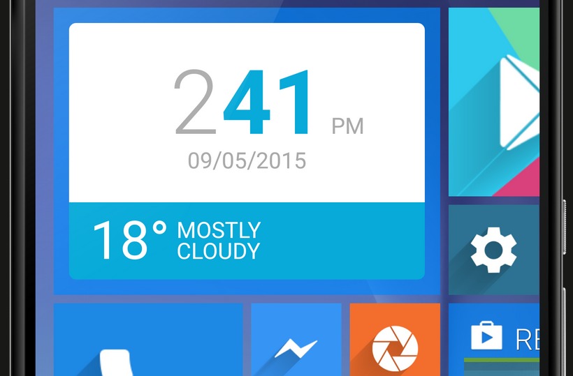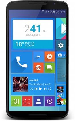
I’ve always thought highly of how Microsoft built its Metro UI for Windows Phone mobile devices. It’s clean, minimalistic, functional, and to a point, even pretty. I’d be lying if I said there was not a time that I wished for an Android translation-slash-execution of the Metro UI. Maybe you have, too. Looks like the answer to our prayers is in development right now – this is WLauncher, and it gives your Android device Windows Phone-like UI and a surprising functionality to it.

There are a lot of Android launchers out there, and believe us, not all launchers are created equal. Some are just going for the looks of other platforms, without thinking of functionality and usability. Good for us that the developer of WLauncher is actually seems like a straight up bloke, who is looking for more than just the look of Metro UI, but the functionality as well.

As you can see from the renders, it’s not a pixel-for-pixel copy of Windows Phone. The colors are a bit different, but the substance of it is the same – it’s in the features. For a more complete explanation of the features set, check out the source link below. For a quick visual demo, check out the video below as well.
https://www.youtube.com/watch?v=LH34bmXHrvI
This really looks like something I personally would want, if the development matures and things go right. If you want to be part of the alpha and beta testing, check out the source link and look for the corresponding reddit threads for that.
SOURCE: Reddit


Link?