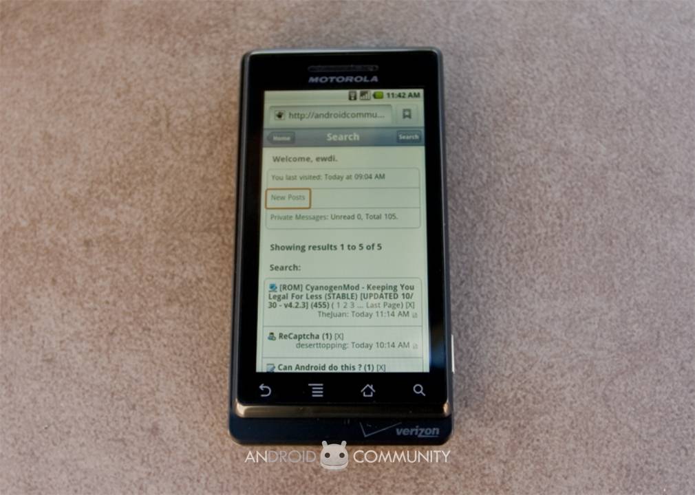
Verizon are going all out to position the Motorola DROID as a significant event, not just for Android devices but for the smartphone market in general, and that demands some serious testing. With sales of the Android 2.0 handset set to begin early on Friday morning, we’ve been playing with the DROID since its official launch last week to see if it lives up to the hype. Some boxes Motorola have definitely ticked; elsewhere we’re left wanting. Read on for the full Android Community review.
Android handsets seem to be pushing the envelope in terms of styling, with the G1 being love-it-or-hate-it distinctive and the European Hero similarly eye-catching. Motorola have certainly gone angular with the DROID, but the high proportion of metal in its construction means it fits in a huge screen and non-spring-assisted slider mechanism without the heft of plastic rivals. That screen, incidentally, is one of the DROID’s best features: 3.7-inches and 854 x 480 resolution, it’s easily a match for the Samsung Moment’s AMOLED panel when it comes to brightness, color saturation and crisp edges. Meanwhile the capacitive touchscreen tech is responsive, though in US form it lacks the multitouch that the European version of the DROID – the Motorola MILESTONE – will offer.
The DROID’s keyboard, however, is a disappointment, considering we were hoping for something that could better on-screen ‘boards. HTC is arguably leading the pack in on-screen QWERTY, thanks to a clever combination of auto-correction and word prediction, but Motorola’s overly flat, tactile-free keys don’t put up much of a fight. The Samsung Moment, for all its layout faults, has better key-feel, while the fact that Motorola saw fit to leave two of the buttons blank and functionless seems plain wasteful. The D-pad ends up little more than a reminder that Android lags behind the iPhone when it comes to compelling games, and we wish Motorola had left it off altogether and instead given us a broader, easier to use keyboard.
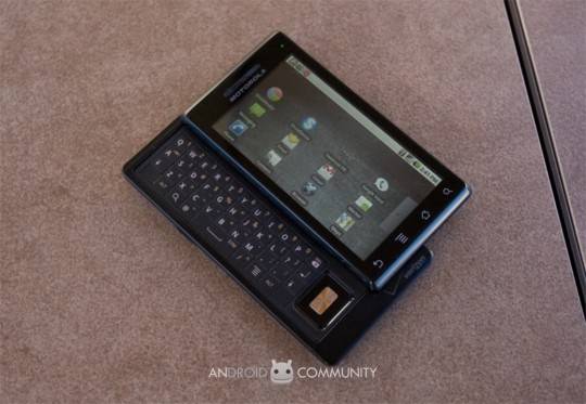
Google claim that they’ve reworked their soft keyboard systems in Android 2.0, but there’s little difference that we can see. What makes the biggest difference is the sheer size of the display, which in landscape mode particularly inflates the keys to chunky proportions. Elsewhere, the new OS makes a number of aesthetic changes, including new animated transitions and more attractive icons. It still falls short of the consistency of, say, the iPhone 3GS, but it certainly feels less of a work-in-progress than earlier devices did.
Android 2.0 is also more social network aware, with native integration of Facebook into the contacts and the provision for more such services in future thanks to “sync adapters” which hook into the relevant apps. Google seem to have looked to HTC Sense for inspiration rather than MOTOBLUR: Facebook contacts are included in the Contacts app (and combined if there’s duplication) with status and profile photo pulled from the online service, though unlike HTC’s system there’s no Twitter or Flickr presence. Exchange support is also a core addition to 2.0, mixing corporate email with POP/IMAP and corporate address book with the Contacts; only the Exchange calendar is kept separate from the personal calendar. Strangely, despite the otherwise unified inbox, Gmail still gets its own app and own inbox, though you can now sync with multiple Gmail accounts.
The Facebook client, although official, is little changed from what’s available in the Android Market for existing Android smartphone users, which means it’s a combination of some local app provision with everything else – galleries, messaging, etc – pushing you into the mobile Facebook site. As for Universal Search, that will only query through your inboxes if you’re actually looking at them on-screen at the time; otherwise it stops at making internet, SMS/MMS, contact and media searches.
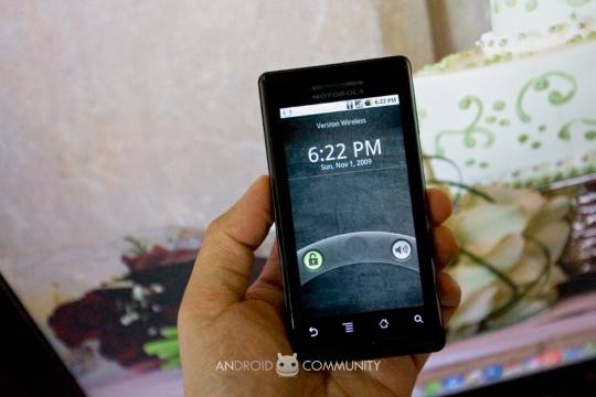
Thankfully the browser itself is fast and stable, with the DROID’s 600MHz Cortex A8 processor keeping render delay to a minimum. HTML5 support has been introduced, together with the ability to double-tap to zoom, though there’s no Flash Lite like HTC have added to their recent handsets. Instead you’ll be watching YouTube video through the bundled viewer app, which certainly works but isn’t quite as streamlined as we’d like it to be.
Striking fear into the hearts of standalone PND manufacturers is Google Maps Navigation, the company’s new turn-by-turn GPS app. Fresh – and currently exclusive – to Android 2.0, the beta offers both text-to-voice and voice control along with all the usual Google Maps features such as satellite and traffic views, a digital-compass controlled Street View and points-of-interest. It works incredibly well, considering it’s Google’s first attempt, and while it lacks some of the finesse of dedicated PND systems the fact it’s free goes a long way to encouraging forgiveness.
Among the DROID’s available accessories at line-up will be an in-car kit, designed for use with Google Maps Navigation. Like other such kits this sticks to your windshield, and when you slot the DROID into the cradle it automatically loads up a straightforward menu designed for easier use while driving. Unfortunately we didn’t have the car kit to test out; what we did get is the DROID desktop dock, a simple cradle with a microUSB connection for powering and syncing the phone. Slotting in the smartphone triggers a “hub” information page, with the time, weather, and shortcuts to multimedia; we reckon Motorola have missed a trick by not including a second battery charging slot behind, however.
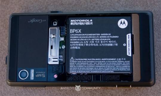
Still, battery life on the DROID has been a real surprise, exceeding our expectations for a device with such a huge display and so much wireless connectivity. A full day – with Exchange turned on and regular use – is certainly possible out of the standard battery, and Android 2.0 adds a handy power management interface which shows what elements of the system drank the most juice and offering ways to tame them (backlight reduction, for instance, or switching off wireless).
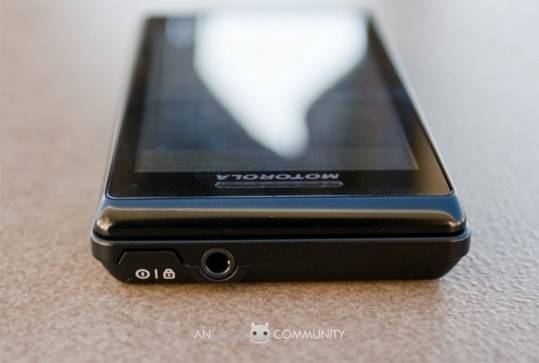
Unfortunately, Motorola haven’t got everything right, and like the keyboard frustrated us there are some other shortcomings as you dig through the system. Android 2.0 makes no attempt to improve the platform’s media handling, so you’re stuck mounting the DROID as a USB drive and dragging-and-dropping new audio, video and image files across; considering Verizon are positioning the smartphone as a direct iPhone 3GS rival, it seems an incredible blind-spot when you consider Apple have iTunes to handle all their media (and app) management. The native media apps themselves are still as ugly and functional in their design as ever, and while Motorola include a 16GB microSD card in the box, the fact that it’s a Class 2 card means that the higher-resolution video files we attempted to play suffered skipping. That sounds like a basic case of cost-cutting, and it’s disappointing that for want of a few extra cents per handset Motorola have undermined what could’ve been a good selling point. It’s worth noting that there’s no hands-free kit in the box, where usually you’ll find a simple wired headset with most smartphones on the market; still, the standard 3.5mm socket means you can use your own (for better audio quality anyway) and there’s Bluetooth A2DP stereo streaming as well (along with Object Push and Phone Book Access, again fresh additions to Android 2.0).
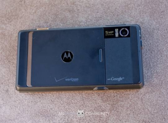
The biggest let-down is the camera, which while capable of capturing decent video falls well short of what we’d expect from a 5-megapixel autofocus shooter in its still images. The autofocus suffers from being both slow and obdurate, periodically refusing to lock onto the foreground subject, and the end results tend towards the murky (even with the reasonably bright dual-LED flash), fuzzy and unusually color-tinged. Since we find it hard to believe that the CMOS hardware itself could be so disappointing, we’re hoping Motorola quickly respond with some updated firmware that tames the visual performance. As for video, the 720 x 480 24fps footage the DROID captures can be wobbly, but the quality is decent for a cellphone camera.
Too many smartphone reviews neglect basic phone functionality, which in the case of the DROID would be to overlook one of its major strengths. As well as proving tenacious with a CDMA signal, the DROID is loud, clear and crisp through both its earpiece and the speakerphone. The side-mounted volume keys are a little too easy to press, but the maximum output from the DROID is plenty loud enough; unfortunately, as with other CDMA devices, you can’t have an active cellular data session while on a voice call, though WiFi and GPS do still work. Business travellers who have been growing used to Verizon offering so-called World Phones – which include GSM and UMTS connectivity so that their phone doesn’t become a useless brick outside of North America – will be disappointed to hear that the DROID is CDMA-only, a decision which we reckon borders on the suicidal when you consider Motorola are targeting this phone at mobile pros.
Still, show us the “perfect smartphone” and we’ll call you a liar; no device ticks every box, and the DROID makes some very convincing arguments across the board. Android 2.0 is an OS that’s come of age, and while third-party applications may lag behind those available in the Apple App Store in terms of blunt numbers, the thriving developer community proves there’s no shortage of imagination. Those looking to replace their digital camera should look elsewhere, at least until Motorola do something to address the dire photo performance, but for those more interested in watching video, communicating via multiple accounts and accessing the web the DROID has some serious strengths. It’s probably Verizon’s best phone right now, and if you’re in the market for a smartphone checking out the DROID should be high on your list of priorities.
Want a second opinion on the Verizon DROID by Motorola? Check out Vincent’s review over at SlashGear!


