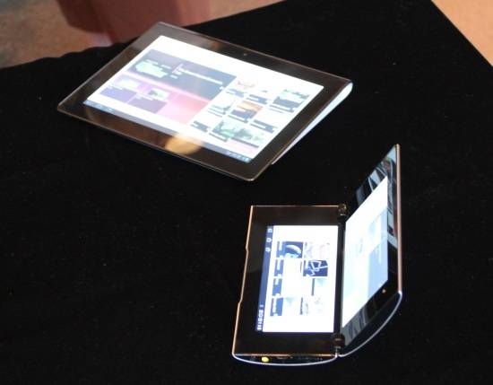
Rumors started awhile back about Sony’s tablets, and now they’re finally out in the open and Sony showed the two tablets off today. We don’t have any specs or a release date yet, a bit odd but we’ll have to take what we can. We’ve got all the juicy details and a look at the different hands-ons around the web for you right here.
Sony has two tablets in the works for us. First up is the S1, a 9.4″ tablet with a 1280×768 display. The tablet has a lip at the top, which the lucky ones who got to get their hands on agreed made it feel great in their hands. The S1 will be WiFi only. The Sony S2 is one of the most unique tablets yet. Similar to the Nintendo DS or Kyocera Echo, the S2 folds in a clamshell design with two 5.5″ screens. With its smaller size, the S2 is going to come with AT&T HSPA+ on top of WiFi for mobile data. Both Tablets run Sony-fied versions of Honeycomb, with some interesting enhancements.
LaptopMag.com took a pretty neutral stance on the tablets, and we can’t blame them at this point. They do point out a lot of the unique features though:
Network Entertainment and PlaySation Games: As you might expect, Sony S1 and S2 tablet owners will have access to Sony eBooks, music and video from Qriocity, and PlayStation-certified games. That last bit means users will be able to play PS1 and PSP titles. Both the S1 and S2 will come pre-loaded with Crash Bandicoot and Pinball Hero.
In a quick demo of Crash Bandicoot on the S2, the 3D graphics were smooth, but having the whole 5.5-inch screen on the bottom dedicated to the gameplay buttons seemed like a bit of wasted space. We asked about titles that are truly optimized touch input, and Sony says those are coming. As you’ll see in the video, Crash plays at full screen on the S1, with the buttons arranged around the side of the screen.
With Playstation games, a la the Xperia Play, the S1 and S2 tablets could be big sellers to gamers. Other cool features include DLNA support and the ability to use the S1 as a remote control thanks to an IR blaster.
As far as physical design, Engadget had good things to see about the S1’s lip:
Let’s start with the S1, shall we? As far as hardware flourishes go, we’ll take ergonomic genius over a gimmick any day, and in that department, the S1 delivers. You see wedges all the time on laptops, but with a slate, it’s an unexpected, wonderful thing. It makes it easy to hold with one hand, and it improves viewing angles when you place it face-up on a table. What’s more, the S1 feels simply airy in the hands. We know, we know. We often come away from these events saying a tablet is lighter than it looks. (We’re looking at you, Toshiba Thrive.) But after handling some slates that are weightier than you’d expect (ahem, Touchpad), it’s refreshing to pick up something that feels well-made, yet unassuming. Sony also decked the tablet out in a textured finish, as you might guess by looking at that dot pattern in the photos. That, too, makes this one of the easier-to-grip slates we’ve handled.
They didn’t rave as much about the S2, saying that like the Kyocera Echo it suffers from a bezel separating the two screens.They do point out that the screens on both tablets are fine, but since Sony only demoed the tablets indoors, how they perform in direct sun is undetermined.
Finally PCMag.com gives us more detail in Sony’s interesting enhancements to the Honeycomb system. Specifically, Quick View, which loads images on web pages quicker, and Quick Touch which supposedly improves responsiveness of the touch screen:
There were demos of the tablets’ capabilities. Both feature Quick View and Quick Touch, two Sony-engineered enhancements of Android 3.0. Quick View offers what Sony reps admitted was the illusion of a site loading more quickly. Side-by-side, two S1 tablets, one in Quick View mode and one in regular Wi-Fi mode, loaded the same Web site. Indeed, Quick View loaded the site roughly eight seconds sooner than the other tablet, but the trick is rather simple: Quick View loads a Web page’s imagery before loading Java Script, offering only the appearance of a fully loaded page. So, it’s not actually loading the page eight seconds faster, but it’s giving you visuals, and in the first eight seconds, that’s probably all you need for typical Web browsing.
Quick Touch supposedly offers more fluid scrolling through menus and Web pages, but the demo merely showed a fluidity that Apple’s iPad has had since launch. That said, some tablets do not have such speedy scrolling and gesture response, so this definitely falls in the “pros” column—it just seems a tad much to name it and call it a feature.
We wish we had a bit more info on these tablets, but it looks like we’re finally starting to see some creativity and variety in tablets and that’s a win. Look forward to more details in the future as Sony releases them, and we get our own hands on these two interesting tablets.


this better work or sony is screwed