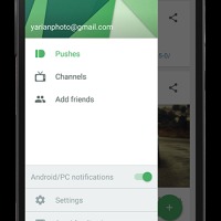
Pushbullet has received a major overhaul, ahead of the official release of Android 5.0 Lollipop. You don’t have to wait for the Google update to experience what it will look like, well at least through this app. It has applied the Material Design, embracing the whole visual language to better improve the app as it seeks to apply the “focus on the user all else follows” philosophy. The update also brings improved navigation and better user control on its settings.
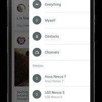
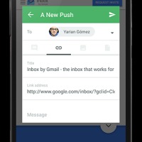
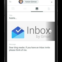
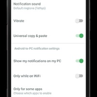
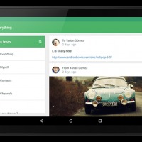
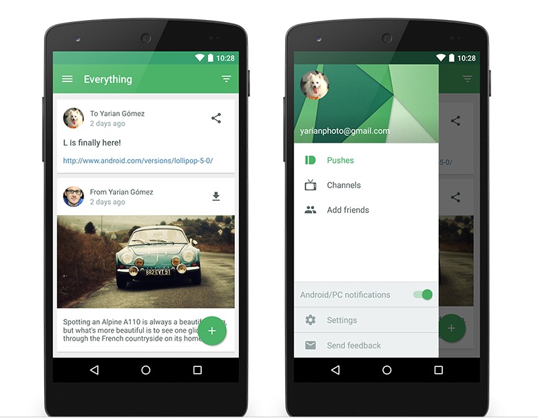
With this major update, users will now be able to quickly access channels and settings, as well as the ability to easily turn on and off the mirroring notifications from the drawer of the app itself. Another new feature is getting an at-a-glance view of the pushes from yourself or your contacts and even your favorite channels. The search feature is also now baked into the app, so it’s more convenient now to search for friends, channels and devices. Pushing is also now more streamlined as you can view it in just one screen and there even is an option to view them full screen.
In terms of the Material Design, the visual upgrades include a card-like interface with floating action buttons, an overhaul of their icons, a more dynamic color theming, a new sliding drawer and better animation. The options for users is also now easier to access, and even the language used in the settings has been changed so you will have an easier time figuring out what it is you are enabling or disabling. All the options and settings are also now just on one screen so there will be less confusion.
If you haven’t been using Pushbullet yet, it is an app that will mirror on your desktop the notifications you receive from your mobile devices, which is important if you’re working on a desktop and you don’t want to look at your phone or tablet every 10 minutes or so. You can download it for free from the Google Play Store. Version 15.0.1 should be rolled out by now to existing users, in all its Material Design glory.
SOURCE: Pushbullet


