We have been working around the clock on our new site design and layout for Android Community, and we want your feedback! We want to make the new design as clean, intuitive, and functional as possible. So take a look around at the new design, and then head over to our Facebook Page and let us know what you think. Leave a comment inside the post (not anywhere else or it won’t be counted) letting us know what you think we could do to make the design or layout better.
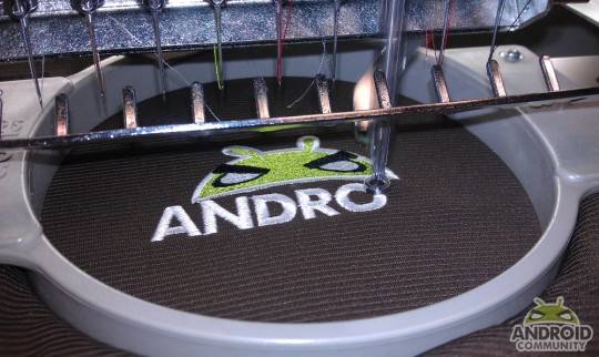
Everyone who leaves a comment will be entered to win an Android Community embroidered polo shirt. Please, make your comment relevant and helpful, we really want to know what you think, and make the site work for you. All of the details about the shirts are located in this post. Here is a preview:

We look forward to hearing your thoughts.


Nice! very cool design.. but the green is too dark.. I like the green on the shirt 🙂
Nice! very cool design.. but the green is too dark.. I like the green on the shirt 🙂
Looks Great!
Looks Great!
Why is your Android so angry? o_O
Why is your Android so angry? o_O
Yeah, what’s he so pissed about?
Yeah, what’s he so pissed about?
Yeah, what’s he so pissed about?
looks good
Looks great but…..the green is too bright. Depending on your monitor size, the top bar doesn’t go all the way across. Since there’s a must read and recent reviews, the featured carousel isn’t needed and most importantly, the Android needs to look like he’s having a good time instead of mad at the world.
Meant the green should be a little brighter.
For the record, Angry Andy (our new logo) isn’t pissed off of angry – we just like the name. And as to why he look so mean — that’s his determined/focused look. Think of it this way — we mean business when it comes to Android and we’ll work day and night to bring you latest breaking coverage around the clock. Furthermore, we strive to bring you the first hands-on / reviews of any new products on the market. I challenge you to name another Android-centric site that can beat our record for being first to review new and upcoming phones.
For the record, Angry Andy (our new logo) isn’t pissed off of angry – we just like the name. And as to why he look so mean — that’s his determined/focused look. Think of it this way — we mean business when it comes to Android and we’ll work day and night to bring you latest breaking coverage around the clock. Furthermore, we strive to bring you the first hands-on / reviews of any new products on the market. I challenge you to name another Android-centric site that can beat our record for being first to review new and upcoming phones.
For the record, Angry Andy (our new logo) isn’t pissed off of angry – we just like the name. And as to why he look so mean — that’s his determined/focused look. Think of it this way — we mean business when it comes to Android and we’ll work day and night to bring you latest breaking coverage around the clock. Furthermore, we strive to bring you the first hands-on / reviews of any new products on the market. I challenge you to name another Android-centric site that can beat our record for being first to review new and upcoming phones.
Looks great, the green looks fine.
I like it, will get a little getting used to (the lower news feed area).
Also if I wanted to be picky I feel like your header area is incomplete on a higher res monitor.
Would be nice to have a solid background….I will post up a link with an example of what I mean in a reply to this post
I’m a little confused why i would need to go to Face-douche to let you know what i think of the new design when i can just tell you in , oh wait , the comment section of your own website. I know your SEO expert probably told you to put that but seriously, does FB always have to get involved. BTW the site looks great but the fact that your story is now off center to the left sort of bothers me. At first i was like “man something seems unsymmetrical”. Then i was like “no the white space of on each side is the same”, then it hit me i was looking slightly to the left to read my own comment as i was typing. Then it started to bother a little more. Whatevs, I’m more concerned about your content then your style anyway. Keep up the good work.
ME LIKEY!!!!
Loving the new site, clean and mean!!! Def easy to navigate, good job guys!
I like it, and love the website. My only comment – and this my usability side talkin’ – but please cut out the ALL CAPS for the story headers. It is HORRIBLE! Thanks.
Right column takes up too much space. Logo looks like it was copied from angry birds and slapped with some green. General layout looks like it could have been copied straight from engadget. Overall I can’t imagine how you’re working around the clock when it doesn’t look like any of the work is your own.
considering its an android site why dont you guys make a mobile version?
A bit “ngadget-ish” but cool, and the logo i pretty love it 😛 Cause Android is badass
the site looks alright…
So as android devices transition from phones to tablets the subject of games will become more important to users….
Not just mini games, but full on epic games … The type on their old PCs. Do you have plans to do more in that space… That one unknown for some potentail tablet buyers… Forget farmville, whos developing COD and Civ5 Type epics for the os
I dig the site, esp the logo, good information, easy access, really like the side scrolling news feeds as well with stories…keep up the good work
I dig the site, esp the logo, good information, easy access, really like the side scrolling news feeds as well with stories…keep up the good work
Looks like a Ninja Turtle. Green too dark. Face to angry.
can we get a coming soon section??? with phones and things that will be coming out in the future the idea came up because my contract is over in sep and i want the newest baddest phone but have no clue what is coming out.