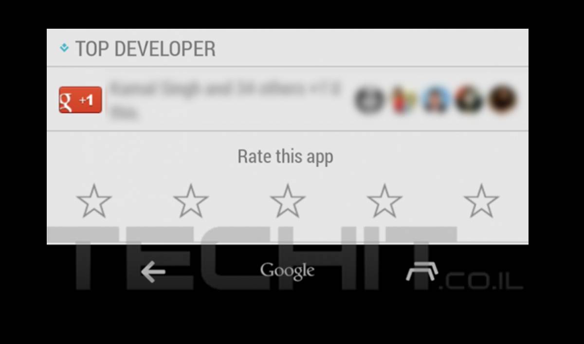
A new leak shows what may be the updated navigation bar for Android 4.4.3. In it, we see revamped back and recent tasks buttons, as well as a new center button, which replaces the home button in some cases. It fits an earlier leak, but the source points to this being dogfooded internally, meaning it may be set for release soon.
UPDATE: This image is captured with a customized navigation bar from here, thanks Jimmy Baez, Artem Russakovskii for pointing it out!
The two side buttons act as you might expect, taking you back or opening up your recently used apps for multitasking. They get a sleeker look and feel, but the functionality doesn’t change one bit. We like the styling, but the new center button may prove troublesome.

Replacing the home button with a “Google” option is said to bring up Google Now rather than offer up the home button all the time. While the Google Now launcher for Nexus devices is a great way to utilize Google Now, it lets us keep a home screen with widgets and apps up front. There is also long-pressing the home button and dragging up to get to Now features.
The leak suggests the buttons will change when you’re in an app versus on the home screen; the Google button will be your Google Now portal on the home screen, while home will take over when you’re in an app. If true, this could mean Now doesn’t have the integration Google wants, and they’re attempting to bring it to prominence on your home screen.
A likely reason for this change is Android Wear, wherein Google wants to offer up a quick way to get to Now. Android Wear leans heavily on Now, so this change could just be a move to make it front and center on all your devices — literally. We should know more about this once Google I/O hits, where we’ll be on the ground at the Moscone Center to bring you all the news you need.
Source: TechIT


god no…but then again I have an S5 so I don’t have them at all
Hope Samsung wont follow this iSt*pidity
I really do not like the time with Sundar Pichai, he is going to cripple Android, he is already crippling
Matias Duarte is in charge of the design of Android. I’m pretty sure he knows what he is doing.
he removed us permission manager, a huge step against users’ privacy
and please don’t tell me that its just a beta, everything is beta
STFU. By using words like “iSt*pidity” you just show everyone what an iDiot you are. If you like Samsung use Samsung, nobody is forcing you to buy a Nexus device so don’t try to force people to use only what you like.
CyanogenMod is better than Samsung 😉
Pure Android is outdated and has never really mattered, that is what Google should take into account
The actual Android way is going to the iLimited crap way thanks to Google’s not understanding what people really want
Unfortunately Google listens just to loud screamers who understand just to “design”, design design design design, nothing iMore
CM is “better” in your opinion. Many people would disagree with you on that. Nothing is better, or best. It is all about individuality & personal usage styles.
You do realize that CyanogenMod is based off of Android right? Without Android, your precious CyanogenMod wouldn’t exist or would be in a different position than it is now. I’m not hating on CM, I’m just saying that you’re treating it like Gold and saying that Android is dirt when Android is the reason that it’s in it’s current position.
android from google = just an engine
android from CM = a whole car
do you get it now? 😉
He fixed something that wasn’t supposed to be there. That a feature for internal testing, one that can be added back via a quick search at XDA.
These are custom. They’re in softkeyz app and you can find them on xda amongst other places.
it’s real not a custom buttons. androidpolice all ready show the changes a month ago. this is real.
I have them. Had them for weeks bro. Look under the fb post and look at the 4th comment down. They come in multiple colors. Black, white, red, blue, orange, Google style and nexus style. Yeah they may be implemented in 4.4.3 but as of right now they’re readily available to any user that is rooted.
They are definitely custom. https://plus.google.com/u/0/116976338546317177623/posts/3wHV778mg1m
thanks!
Lolno they’re not. https://plus.google.com/+ArtemRussakovskii/posts/CoN4CGAMbhS
Seems to be the case with this screenshot, but they are based on real Google designs as posted by Android Police. Chances are they’re being targeted for 4.5/5.0 rather than 4.4.3 though.
They should also allow u to move apps to sd card since they took it away in the 4.4.2 android update.
Hahaha. Fooled by a custom navigation bar.
I’m glad Android Police is careful about being fooled by stuff like this. Haha.
I’m so glad because those new navigation buttons looked awful!