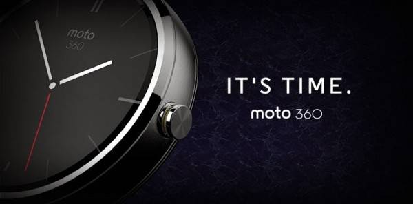
A Moto 360 repository is now available, showing all kinds of neat stuff we’ll see from the new wearable. Though it doesn’t give too much away, it does show us what the interface will look like in regard to buttons and such. We’ll also get a good idea of how the default interface could look when no notifications are showing up.
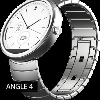
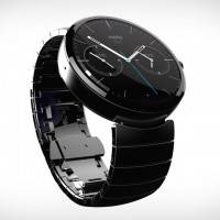
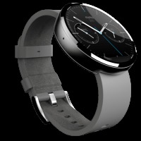
The Moto 360 is meant to be more watch than device, and the styling proves as much. We like the rounded shape, and an image of the clock interface shows a battery level indicator in addition to the time. That’s a strong indicator that the dials that work in addition to the clock face can be changed in settings to your liking. There is also a folder with a ton of glamour shots of the watch, if you need something to make you want it even more.
We also get a whole lot of reference images regarding buttons, and there is even a GIF of the “spinning” icon we’ll see when the Moto 360 is working on something. We even get a glimpse of how social buttons may look, with Facebook, Google+, Pinterest and Twitter all represented. If you’re a design snob, the whole page is worth a glimpse.
If you want an idea of what the big picture will be, we’ve included some of the main images below in a gallery. The icons are a bit flat, and show the resolution challenges some will face when designing for the smartwatch format that is Android Wear. Still, we enjoy the glimpse into the future. Check them out below, and let us know what you think in the comments section!





My Uncle Nathaniel recently got a nearly
new red Chrysler 200 Sedan only from working part time off a home pc… find
out this here FiscalPost.ℂom