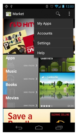
Ice Cream Sandwich removes the ubiquitous Android Menu bottom from its comfy place below the screen and casts it adrift on the sea of interface, where it floats around the screen like Tom Hanks and a volleyball. This change has given grief to a lot of developers (not to mention users): Is the Menu section hiding out in the navigation bar? Slumming it up top near search buttons and titles? Fret not, devs: the latest post to the Android Developer Blog gives some guidance on exactly how to handle the new system.
First of all, it’s not a “Menu button’ anymore. It’s an action overflow: functions should only be placed in a menu if hey can’t be reasonably handled elsewhere in the interface. Depending upon your app, what it’s designed to do and what device you intend it to be used on, that could cover a whole lot or not very much at all. Take a look at Google’s example: for every app that needs a search function, a search bar is present on the top. Don’t need search, or any of the other standard bar functions? The action bar disappears – in which case, the menu button action overflow reverts to its position in the navigation bar. Unless you’re using a tablet, when it slides on over to the notification area. Unless you just build a button into the app itself. Or not.
Herein lies the problem with radical interface changes: you have to retain people to use something that they’re already comfortable using. I’m not saying that removing the menu button was a mistake – on my custom Galaxy Nexus ROM, I have the option of a permanent menu button and leave it disabled. But users need time to acclimate to the new system. A lot of time, thanks to the multiple versions of Android still being sold on devices at retail. (Deleting the Search button was a mistake.) Developers, if you’re having trouble adjusting to the new system, not to mention making sure that your Ice Cream Sandwich apps are backwards-compatible, be sure to give Google’s blog post a gander.


What Google needs to focus on is having this “menu” bar at the same place on the screen.. Even in their own apps it moves all over the place.. (top bar in some apps, bottom bar in some apps) See Market and Voice, YouTube, Reader where its on the top.. Gmail and Maps at the bottom..
Personally I like the SplitActionBar. It utilises available space if necessary and doesn’t bundle everything into the overflow. An overflow with 9 options would be awful.
i agree that the menu button should be placed at the top right corner consistently even the second (split) action bar is used.
Make it simple. Otherwise people will get confuse