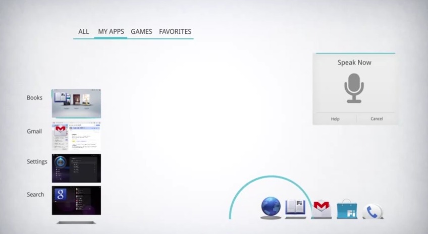
Google’s Android 4.0 Ice Cream Sandwich OS is up for an award for the overall user experience in Android 4.0 ICS at the Parsons School of Design 2012 UX Awards. The team at AndroidDevelopers put together a neat little video showing off Android 4.0, as well as their inspiration and exploratory design and graphic elements of our favorite mobile OS.
The screenshot above is just one of many aspects of the video that caught my attention. I couldn’t help but wonder what ICS could have been, and what parts of this we still might see in the future with Android 4.1, or Jelly Bean and beyond. The entire video is awesome for Android fans but around the 2:10 mark they start showing us a look at their exploration and ideas as they designed Ice Cream Sandwich.
My image above came from the 2:30 mark where the Android Developers wanted to show some of the visual and motion graphics that were possible with Android 4.0 ICS, but for whatever reason didn’t make the cut. The way the icons fly out of the ground, bounce when in use and flow so smooth really is neat. I’d love to see this is future versions of Android.
We here at Android Community obviously love Ice Cream Sandwich, and I’m sure many of you do too. The simplistic design, smooth animations, and amazing multitasking are all about what makes Ice Cream Sandwich’s UX one of the best. Whether it wins or not, ICS is a winner in our book.
[via Droid-Life]


Ice Cream Sandwich and Jelly Bean sound yummy.
I’m just trying to envision what Android 5.0 will look like. Will it be like what apple did? Or will it bring useful features? I am leaning towards the latter.
I’m just trying envision if ICS will be on my Samsung Galaxy S2 Skyrocket in my life time. Yep, I frustrated