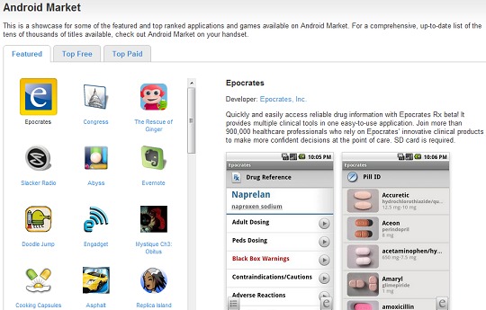
This is a long time coming, that’s for sure. The previous version of the online Android Marketplace, the one that you could search from your computer, hasn’t always been the best representation of the digital marketplace. Not by a long-shot. The layout wasn’t all that great, and it didn’t do a very good job of showing what was even available. Google finally realized it was time for a change, and they’ve made it happen.
The online version of the Android Marketplace has got a pretty good aesthetic tweak over the weekend, and thankfully even its usability has increased. You can still see the Top Paid, Top Free, and Featured applications, but now the navigation tabs are at the top of the page. You’ll get a nice little app icon still, but now you can simply scroll up and down in any particular section, without having to worry about dragging the bottom of the screen to the left or right.
Unfortunately, there’s still no search box. Which has to be the most frustrating part of this, considering where this is coming from. Google, add a search box to your online Android Marketplace. This is something that should be pretty obvious. Also, we’d like a way to see all the applications available in the Marketplace, and not just the top versions of a particular pay-scale. Featured is great, but we would still like to show off the Market outside of our phones.
[via Android]


